Review + Landing Page = Match Made in Heaven


Having positive reviews on your landing page can make a huge direct impact on your conversion rates. Both in terms of leads and sales.
Here are some real-life results of having reviews on landing pages:
- 60% more contact requests
- 14% boost in conversions with longer reviews
- 37% more sales with exit intent popup
Want the same for your business? Let us go over how that is possible.
Related Key Website Concepts Defined
Okay, so you have a website. Great.
Its main goal should be to get people to either turn into leads or directly into sales. Let us go over the basics of what a landing page is, what counts as a review, and what is the purpose of review widgets.
What Is a Landing Page
According to Oxford Languages, a landing page is “a web page which serves as the entry point for a website or a particular section of a website.”
In the digital marketing world, people often define a landing page as a standalone page where someone “lands” after clicking an ad, an email, or a search engine result.
They are often search engine optimized and their specific goal is to present relevant information to the clicker.

Landing pages are designed to be:
- Clear
- Informative
- Engaging
- Visually pleasing
If you want to measure how good a landing page is, you need to look at its conversion rates. Comparing conversion rates between landing pages is also a great way to notice what works and what does not.
Psst. the best way to compare one landing page with another version is to perform AB or multivariate tests.
Broad Definition of Landing Page
If you thought that a landing page can only be accessed from an ad or search engine, think again.
Everything on your website can be classified as a landing page.
Here are some examples you might not have considered to be a landing page:
- Homepage
- The pricing page is one crucial landing page (but not often landed on from ads)
- Individual product pages
- About us
- Case studies
- Review page, or references page
In case your homepage is landed on from Google, it counts as a landing page. And all other clicks on your site from there on can also be considered to qualify as a landing page.
Even though many think that the principles of creating a successful landing page only apply to pages that are accessed from paid advertising, this is not exactly true.
Potential customers might browse your website surprisingly thoroughly, so you should consider adding that all-important social proof to all relevant pages. The easiest way to do this is to use online reviews and review widgets.
Next up, we will look at how to design your website and each individual landing page to fit the needs of different types of customers.
4 Buyer Personas to Consider
Let’s quickly go over the different types of buyer personas your target audience consists of.
Note that these are universal ways to categorize buyers, and your ideal customer profile consists of traits, such as title, company size, title, location, etc.
At the end of the day, purchasing decisions are made based on reason and emotion. Furthermore, the decisions can be fast-paced or take some time to ponder.
Based on the speed of the decision and guiding principles in deciding, buyers can be divided into four different types.
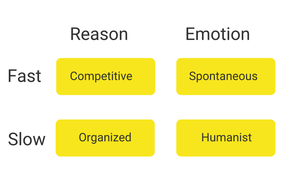
Competitive buyers make decisions fast, but they base their decisions on reason.
Spontaneous buyers are fast-paced buyers, but their mentality is that what feels good, probably is good.
Organized buyers want to base their decisions on reason and take their time before committing to new products or services.
Humanist buyers are slow to make decisions, and they let their emotions guide them.
Note that these are not absolutes and each person can be affected heavily by the price of the product, whether the person is using their own money (B2C) or someone else’s (B2B). In other words, a humanist B2C buyer might be organized if they shop during the night and also if they are placing a purchase order at their work.
Okay, now we can move on to how these different types of buyers can be influenced by landing page design, layout, and content.
Basic Design Principles of Great Landing Pages
Even though there are many differences in terms of target audiences between a B2B company and a traditional eCommerce site, their landing pages essentially follow the same principles.
- Compelling headline
- Unique sales argument and benefits
- Interesting header image
- Call to action buttons
- Social proof (customer testimonials, reviews, case studies, press mentions, …)
The key is to offer relatable and relevant information to all types of website visitors. Pay the most attention to your landing page headline, as that is how you either get visitors to stay or leave.
The key takeaway here from looking at the buyer types when designing your landing pages is to:
- Identify that prospective customers make purchasing decisions with different criteria
- Critically review your landing pages to see if they are designed to speak to all customer personas
Next, let us talk about what online reviews are and how it makes sense to add them front and center to your marketing copy.
Online Review – Definition
Online reviews are basically any form of public statement your current customers have written about you online.
These include:
- Google reviews
- Facebook reviews
- Reviews on any review platform (G2, Capterra, Yelp, …)
- Comments on your social media posts
- Instagram stories (images, videos)
- TikTok or Youtube reviews videos
Moreover, reviews count as social proof and they can even count as user-generated content (UGC) if someone is posting about your product being used in real life.
With Trustmary, you can create a Google review widget to boost people's trust in your brand.
Paid or Unpaid Reviews
A general rule of thumb is to never pay for reviews.
That way, you can ensure that you are getting honest reviews that can even help you further develop your products. Happy customers will recommend you without any incentives.
However, some brands have opted for sending out freebies to influencers to get them to do a product review video. There are also many guides out there for content creators on how to get free products to review.
This is all because video testimonials and product review videos increase conversions on your website.
We will cover that topic more a little later in the section “Don’t take our word for it”.
Now that we have covered two of the core concepts related to this matter, let us move on to how you can add reviews to your landing pages
Review Widgets Explained
According to Collins Dictionary, if you are unsure of what a small device is or how exactly it works, you can refer to it as a widget.
This does not sound too helpful in this context though.
However, Merriam-Webster’s definition of what widgets are is very down to Earth: “a small software application that is designed to provide a specific piece of information (such as news, weather, or traffic updates) or a specific function (such as taking notes or controlling another application) on demand.”
In other words, widgets are add-ons to your website that provide more value to the visitor.
They are implemented with a piece of code to your website and they can be either in-page or triggered as a popup.

Widget vs. Review Widget
The only real difference between a widget and a review widget is that a review widget has at least one review on it.

The core idea of a widget is to draw attention to it. Then the headline, widget body copy, and the CTA button should guide your visitor to complete the wanted action.
Review widgets work better than any other types of widgets because they use the power of social proof. Lets face it, people want to see proof that your products or services are what you promise them to be.
If they cannot find that information on your website while browsing, they will leave your page to look for those reviews. The danger here is that they will not come back to purchase, signup, or request a quote.
It might be that they found a bad review or that they simply got distracted while looking for reviews.
Therefore, it is a smart move to provide browsers instant access to your best reviews by using review widgets on your website.
Next up, I will go over different ways you can use review widgets to build trust in visitors while getting
Review Widget Functionalities
There are many ways you can use review widgets on your website. The most important part is to consider which reviews you want to showcase, to whom, when, and where.
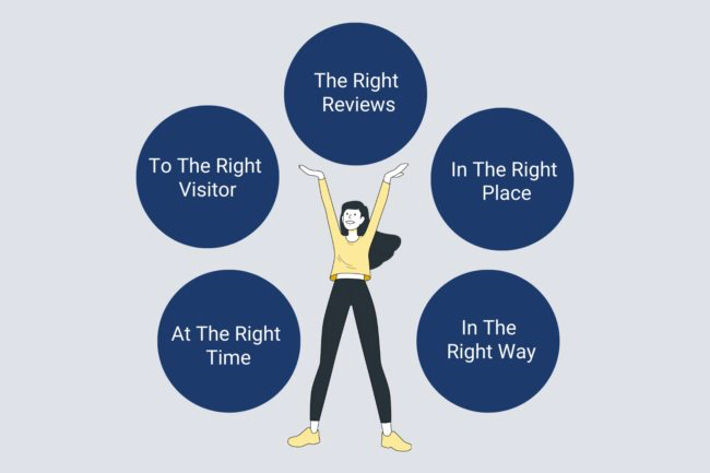
Here are just a few examples to give you an idea of how to use them to boost your site and its performance.
- Sign up form to a newsletter
- Quote request
- Download a guide
- “Book a free consultation” popup
- Exit intent popup
- Discount code for scrollers
- “Running low” announcement
- Someone just bought a product
- Chatbot with customer reviews
- “4 other people are looking at the same hotel!”
With Trustmary, you can choose from many different ready-made widget templates. They can then be customized to fit your brand.
You can either hand-pick which reviews you would like to use, or you can let us choose the best ones for you!

Why Have Reviews on EACH Landing Page
Here are three reasons, why each business needs to embed customer reviews on all of their landing pages.
1. Review Schema Markup to Search Engines
If you're not obsessed with technical SEO, you probably have no idea what review schema markup is.
However, it's more important for your SEO success than you might think.
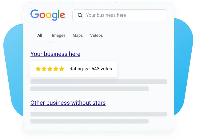
It's those little star ratings brands have on search engine result pages. In our example below, you can see that Trustmary has added reviews and review schema to that specific landing page, so all keywords related to it will prompt them.
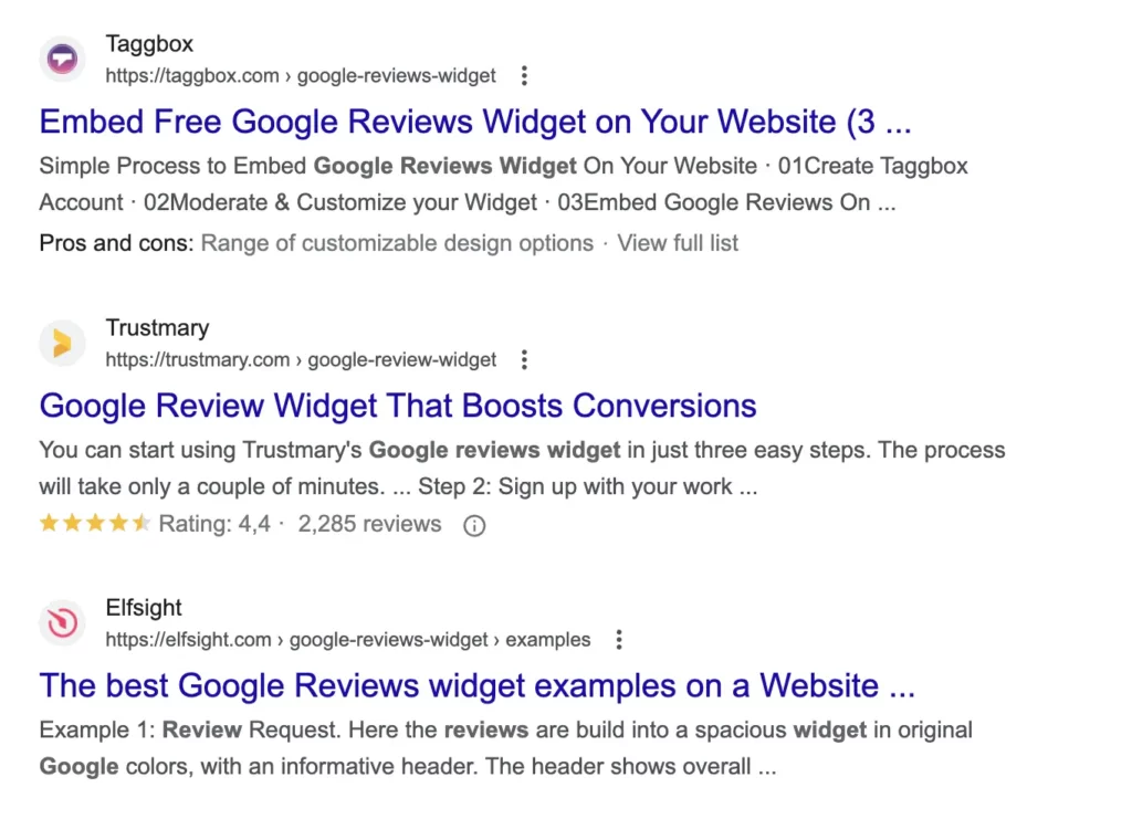
Review schema needs to be manually added to each landing page separately.
There are tools for that, like Trustmary, that can automate the whole process. But even with Trustmary, you'll need to add a review widget to all of the landing pages you want to have stars on the SERPs.
2. Visual and Emotional Social Proof
By using reviews on your site, you are essentially providing your visitors with the most relevant information for them – what other people like themselves have thought about you.
In other words, whether you can be trusted or not. Visual social proof is a very crucial trust signal.
If they have landed on your page from an ad, you have only a few seconds to convince them to stay longer.
The average time on a page across all industries is 52 seconds, which can be significantly improved by making your review widgets visually pleasing.
It is also important to provide your potential customers with real value and personalize their browsing experience with emotionally relatable content – social proof in form of customer reviews.
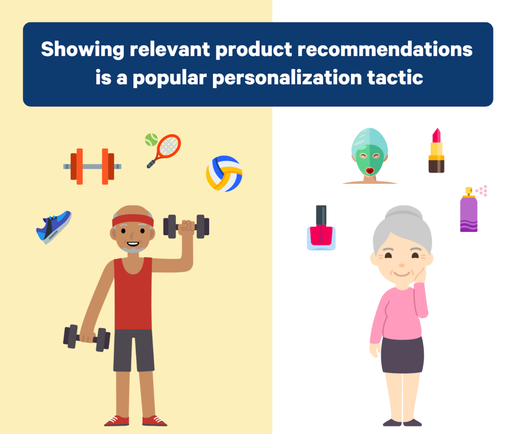
One great way to personalize your visitors’ browsing experience is to show relevant product recommendations as well as what customers have thought about them.
3. Help the Visitor – Provide Enough Information
Even when we are online, humans have an internal desire to belong to a group.
We identify ourselves as group members according to our age, gender, location, profession, education, work title, and numerous other demographic information.
Additionally, people identify themselves as a part of a more specific group that can vary from one situation to another.
These include, for example, but are not limited to:
- Parents
- Fans of a certain sports team
- Pet owners
- Residents of an area
- And so on
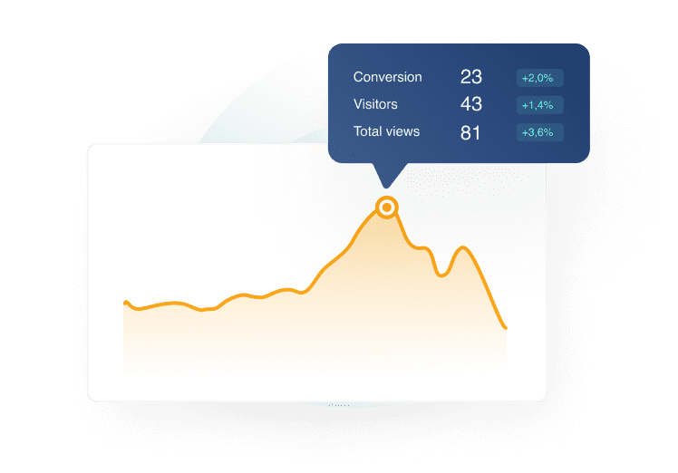
Use this information to boost your conversions. Show what people of a specific community have thought about your product or services.
By providing this crucial information, you are essentially helping the visitors choose you over your competitors.
Consider this: If someone is looking for a roof renovation in their area, it is more convincing for them to see what people close by have thought about the business whose site they are on, instead of someone from a thousand miles away.
Take away your leads’ trouble of having to ask around their friends and neighbors: Add social proof directly to your website.
4. More Content Builds Trust
There is no need to gate-keep your reviews. In fact, create a review page with all reviews.
When it comes to reviews, there are a few factors that people look at:
- Number of overall reviews
- Overall star rating
- Open comments
- Recency of reviews
If a business has a solid five-star rating, it might seem too suspicious to potential customers. But having a 4.2 to 4.6 rating will seem more reliable. Especially so, if your business has a great number of reviews.

Interestingly, the recency of reviews has become a big impacting factor on purchasing decisions. As much as 47% consider a product to be unpopular if it does not have recent reviews.
Recency is a subjective matter, but every business owner should pay attention to getting reviews regularly to avoid this problem. As a general rule, a review is recent if it is left a few months ago.
Even if you have some negative reviews, you should not censor them, but rather answer them. It functions as a channel of communication that can help resolve any misunderstandings and even turn your online reputation around.
How to Add Reviews to Landing Pages
No matter which website platform you use (WordPress, Squarespace, Wix, Shopify...), you can now easily add reviews to your website.
Happy customers will always find a way to leave reviews, but you should try to give each customer easy access to review your business – right after they have interacted with you.
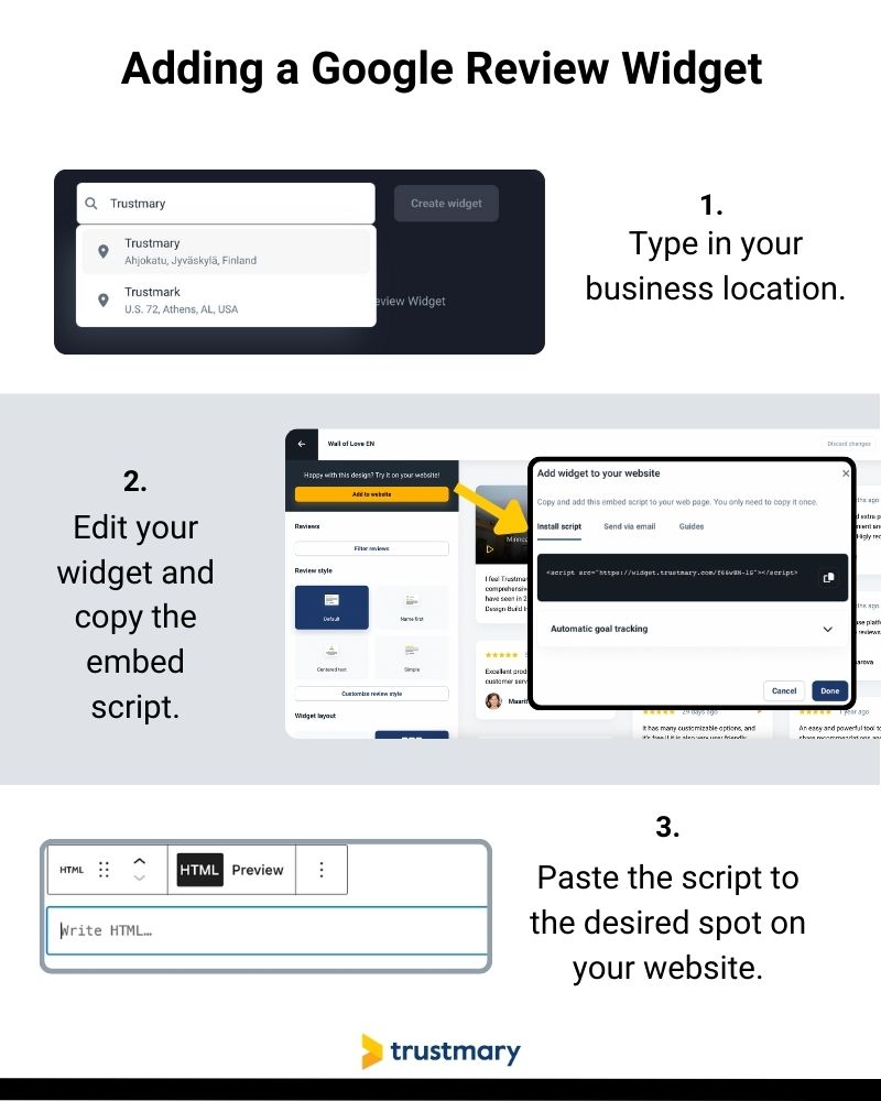
3-Step Walkthrough: Embed In-Page Reviews to Landing Page
This simple walkthrough is specifically designed for embedding Google reviews, but you can do the process to all your existing reviews in Trustmary as well.
You can even import reviews from an excel spreadsheet!
Step 1: Type in your Google My Business
You can type in your location here ⬇️
Step 2: Copy the Embed Code
Feel free to either use ready-made templates or customize the review widget at this point already. You can easily modify the widget also later on.
Step 3: Paste the Embed Code to Website
Go to your website editor and paste the embed code.
And you are all done!
Popup Widgets to Landing Page: 3 Steps
In case you want to add popup review widgets, there is no need to copy-paste the embed code.
All you need to do is:
- Import reviews
- Create widget
- Customize page rules in Trustmary
Below you can see one example. You can easily include or exclude certain pages.
Additionally, choosing the activation event for that review popup has probably never been easier.
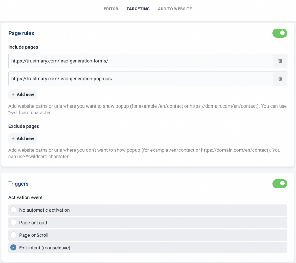
If you want to customize the triggers even more, you can show different widgets to people coming from different sources by using UTM tags.
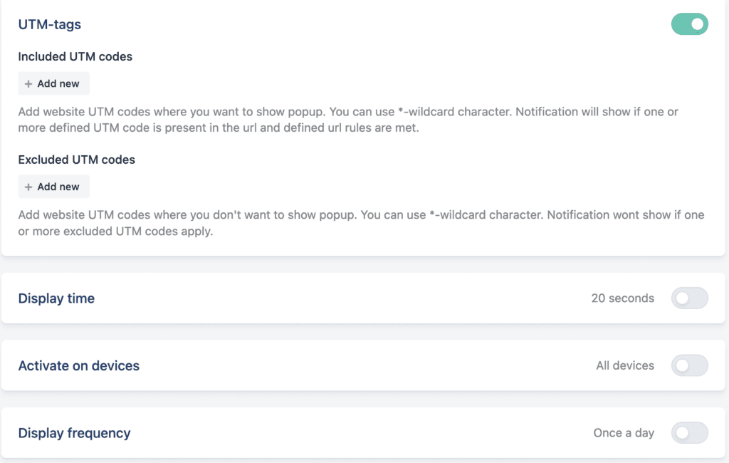
Other factors to customize include:
- Display time
- Activation on different devices (mobile, desktop)
- Display frequency (minutes to even months)
Places That Need a Review Widget
Placing review widgets is not really rocket science, but there are some principles you can consider following. They have the possibility to skyrocket your website conversion rates to a whole new level, with little to no effort.
There is no 100% right place to add review widgets, but you should test what works best for your company.
(Exit Intent) Popups
Yes, I know. They are a nuisance.
But they are effective.
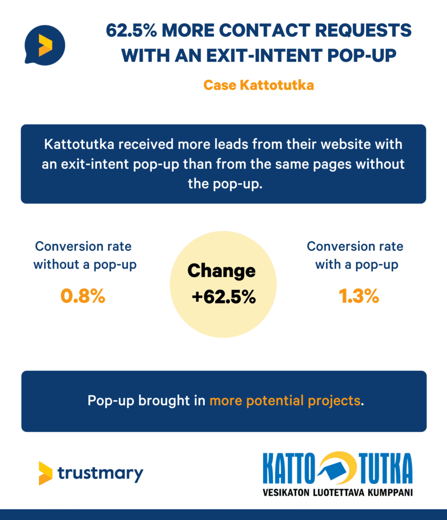
One of our customers got 62,5% more contact requests just by adding an exit intent popup to their services pages.
Bottom CTA
If you have managed to get anyone to scroll to the very bottom of your page, they are very likely to convert.
Make them do so by adding a bottom CTA with some reviews next to the actual CTA button.
Below you can see one example of how we at Trustmary have done this. Underneath each blog post, we have added a call to action to convince people to take our product for a spin.
In addition, we have added comments from existing happy users to convince browsers to try it as well.
As Close as Possible to Each CTA Button
Come to think of it, as reviews are such a powerful tool in convincing people to convert, it is best to add reviews as close as possible to each CTA button you have.
Do not overdo this, but this is something to keep in mind when designing the layout of your landing pages.
When a customer feels that they have enough information at hand, they are more likely to convert.
Close to Social Media Share Buttons
If you can show that others have shared their opinions online about you or your products, more people are likely to follow. Again, thanks to social proof.
If you can convince people that it is the norm to review you and to share that review with their social circle, others are more likely to follow suit.
Don’t Take Our Word for It – Real Results
In case you still feel a little underwhelmed, have a look at these amazing results companies have got just by adding reviews to their landing pages.
Note that these are real-life results gathered within an AB test period to validate the importance of having reviews.
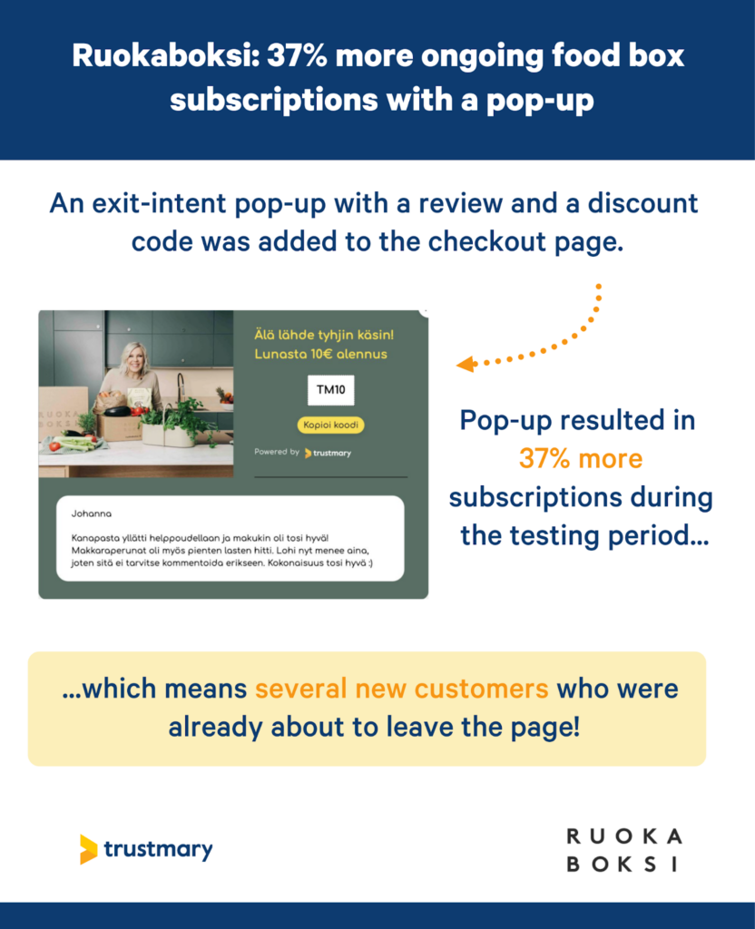
37% Increase in Subscriptions with Review Popup
Ruokaboksi tested the effectiveness of having a review popup on their checkout page against not having one.
As they are a subscription-based business, this increase in their conversion rate directly translates into more ARR.
Quality of Reviews (Long vs. Short)
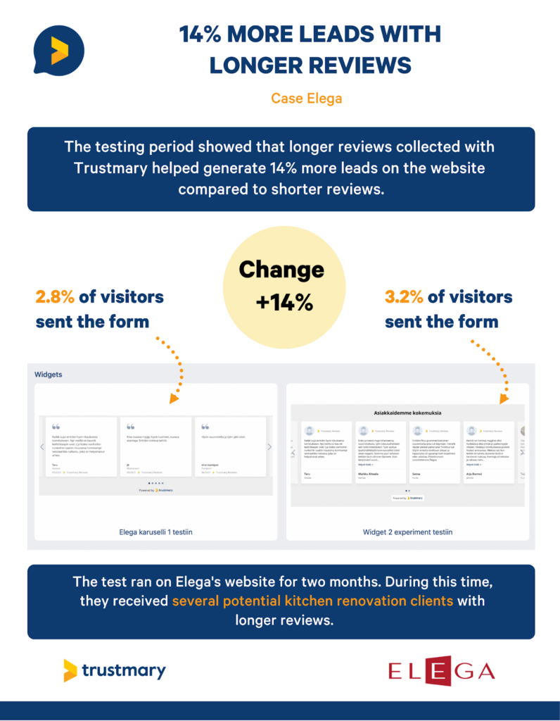
Elega is a kitchen renovation company, so all leads from the website are worth their weight in gold. The same goes for all construction industry marketing efforts! Especially in this current state of the economy!
They were already aware that having reviews on their homepage is important, so they focused on testing how the quality of the reviews affects conversion rates.
It turns out that using longer reviews resulted in an increase of 14% in contact requests!
Are you still not convinced?
Here are some more stats to reassure you that adding reviews to each landing page just makes perfect sense.
Incredible Conversion Rates Summarized
Here are some compelling results with using online reviews:
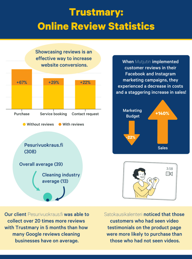
- An eCommerce business Mutjutin got 140% more sales while spending 22% less money on ads
- Satokausikalenteri saw an overall increase in conversion rate with video
- A cleaning company was able to collect 308 reviews within 5 months of starting to use Trustmary. This is 20 times more reviews than the average number of Google reviews for the industry.
Remember: Collect More Reviews for Your Business
If you are struggling to get reviews, here are a few tips to help you get more reviews and do effective review generation.
Tip 1: Sending out free samples or partnering up with a relevant expert that your target audience relates to is a great hack for getting those first reviews.
Tip 2: After getting the ball rolling, it is best to create an actual review marketing strategy to get authentic reviews from real users.
They can then be used on an individual landing page or more generally on your website with the help of review widgets.
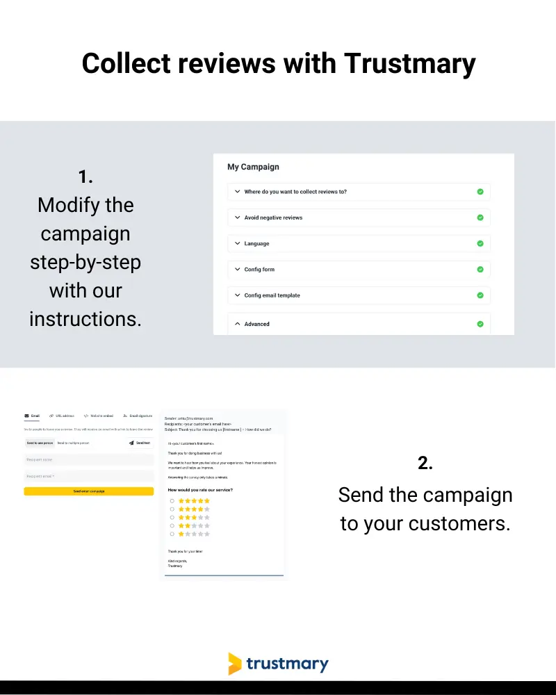
Tip 3: Start using Trustmary to get long, high-quality reviews.
While you send review requests directly from the software, you can even collect Google reviews to automatically boost your search engine visibility.
Further Reading:
- Authentic Review Generator: Why You Need One
- Online Reviews: Statistics That Will Blow Your Mind [2025]
- Customer Reviews Template: Ask and Showcase
- How to Add Google Reviews to Website (for Dummies)
FAQ
You can either use an in-page widget or popups to catch your visitors’ attention. Embedding reviews to landing pages with Trustmary is so simple that you do not need any coding skills whatsoever.
Can I add reviews to landing pages for free?
There are four easy steps you need to take:
- Sign up for Trustmary
- Import reviews
- Choose a widget template
- Copy-paste the embed code to your website
You can embed one review widget for free, and you can import reviews from Google, Facebook, and four more sources!
How to increase the conversion rates of a landing page?
The easiest way to boost conversions fast is to add reviews to landing pages.
Reviews function as relatable, engaging content for website visitors. By having reviews embedded in your website, you prevent visitors from leaving your site to look for those reviews. Because they will Google you and want to see the reviews you have got.