6 Examples of Great Testimonial Pages That Generate Sales


This article shows you 6 different testimonial pages that you can use as inspiration when planning your own customer testimonials page. We also look at the pros and cons of each design choice.
If you want a shortcut to creating your page, add existing reviews to your website for free in just a minute.
Otherwise, let's read further!
6 Examples of Great Testimonial Pages That Generate Sales
Great testimonials, reviews, and customer stories are your business’s best assets that you can use to generate leads and sales.
One great review can bring in several new customers because 88% of consumers reported that they trust online reviews and testimonials and consider them before making an online purchase on a website. In another survey, 92% of consumers reported that they read reviews specifically when planning to buy a product.
Your ideal customers’ buying decisions are influenced by testimonials and reviews and that’s why a testimonial page on your website is one of the best ways to generate sales and convert customers faster.
No testimonials yet? We can help you create an automatic and authentic testimonials generator.
Why display customer testimonial pages?
It will make it easier for your target audience to access and read reviews from existing customers without having to search for them. You can show them what they’re interested in with great video testimonial and testimonial pages.
If you don’t have customer testimonial pages yet or you’re looking for ideas on how to create a perfect testimonial page to generate sales (and leads), I’ll share 6 excellent examples of how to display customer testimonials from happy clients.
Let’s roll…
1. WindWard Software
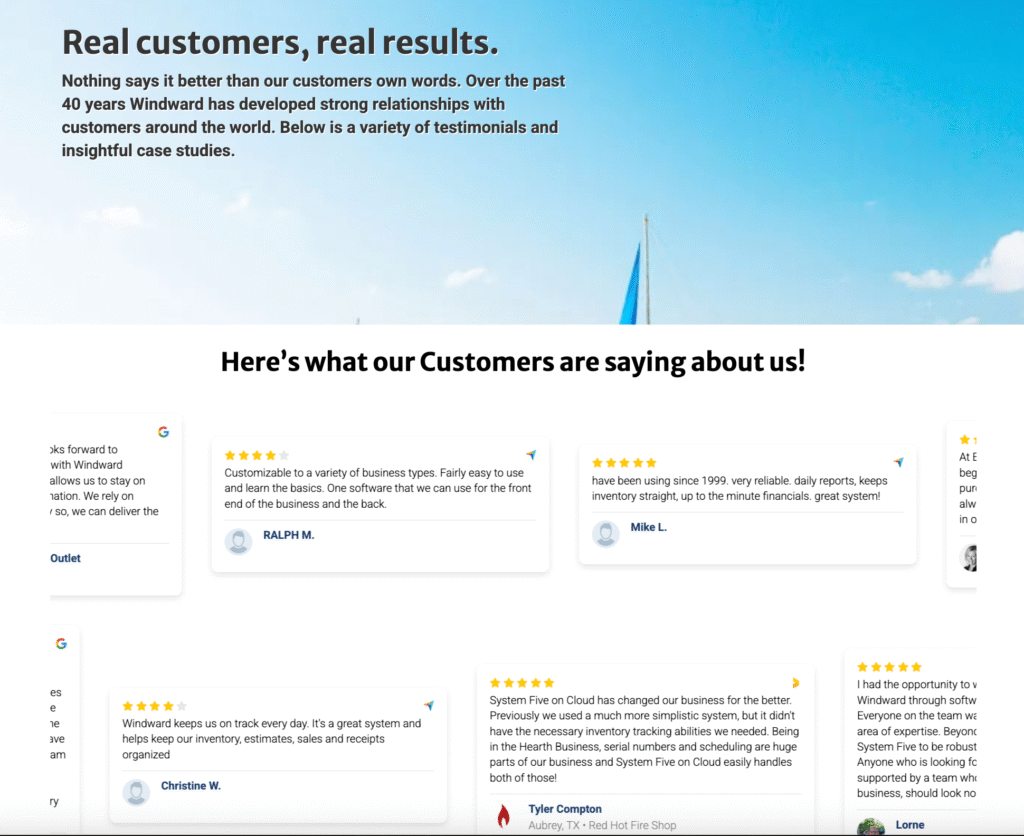
WindWard Software has an excellent testimonial page. It is well-designed and has a very scrollable outline. The best thing about their review example page is that they have featured different types of reviews and testimonials, such as short text testimonials, longer case studies, and customer logos.
A review page like this can provide potential customers with answers to their queries that they may have related to your product. Adding different formats of reviews ensures that ideal customers can access their favorite type of review (e.g. video testimonials, short comments, etc.). The idea is to provide everyone with something on the review page your site has.
With Trustmary, you can create, for example a testimonial wall on your own website. You can hand-pick which testimonials and reviews you'd like to show and to whom.
2. Vainu
Vainu provides its users with the most accurate and automated Nordic company and contact data.
Vainu's review page features third-party reviews from many sources, and an overall score for all its reviews.
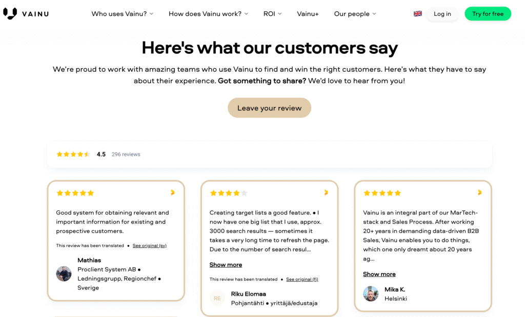
They have added images of badges from any reviewing site that matters on their website's testimonial page. What’s great about Vainu's page is that people can get an overview of customer satisfaction, as well as dive deeper into specific comments by clicking the "show more".
People love interacting with reviews.
Another cool feature Vainu has is placing the reviews and case studies directly in the menu under "ROI".

Aamer Hasu, the VP of Marketing at Vainu states:
– If you have a website without testimonials and without real people praising your product or service, you’re missing out. You can’t establish trust with website visitors without reviews on your website. We just want to give our customers the chance to easily provide feedback and for us to display it anywhere, such as emails, ads, and our website.
Read the full case story on how better feedback leads to more sales at Vainu.
3. Academy of Brain testimonials page
The Academy of Brain's target group is HR, middle managers, and executives in large companies. However, buying paths are complex and often involve a buying committee.
The Academy of Brain works with many large organisations. Its Sales and Marketing Director, Janne Nieminen, points out that a logo alone is cold and does not evoke the same sense of relatability as a recommendation from a person.
– A genuine comment, name, and face build trust. Many websites feature big logos, but a comment from a real person reflects the real value they have experienced or received.
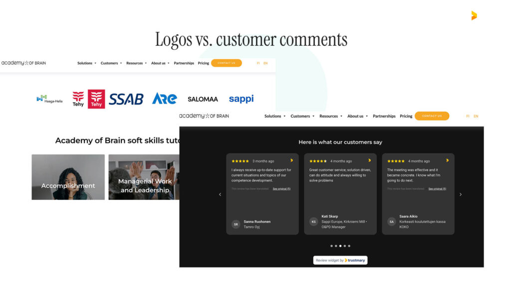
Academy of Brain uses both tactics: Logo marketing as well as customer comments from those big companies. So far, it's worked great. Adding reviews and testimonials to the website has increased the length of site visits and brought more traffic.

Nieminen thinks it's important to have a review page that automatically aggregates all reviews from different sources.
– Trustmary enables us to have a review page where all public feedback left by customers is in one place. We link this page to all potential customers, where they can go and read for themselves what others have thought of our service, he continues.
Read more about how the voice of the customer can boost sales and marketing.
Placing testimonials near CTAs is a great way to boost conversions by adding that needed social proof and trust.
See what I did there? With Trustmary, you can add your testimonials to where they matter the most: near important call to actions.
4. Holistically Rx
Holistically Rx has a testimonial page that features the real experiences of people who've been customers.

Holistically Rx is an integrative medicine telehealth platform that combines conventional medical expertise with holistic therapies to provide truly personalized, patient-centered care.
Through secure virtual consultations, patients can connect with licensed professionals ranging from primary care providers and specialists to holistic nutritionists and practitioners. To maintain service quality and strengthen online trust, Holistically Rx leverages Trustmary.
Dr. Kaufman explains the importance of having customer feedback surveys as a quality control tool, and why having reviews publicly available is crucial in building trust:
– Our patients are vulnerable. Inviting them to share their health journey without feedback mechanisms in place for me to control the quality of service would be frightening. We need to give everyone a megaphone to call out if something didn’t go well, and then fix it right away.
Dr. Kaufman has seen a great boost in sales by adding trust signals on the website.
– We’re offering a new service, and there’s always some healthy suspicion towards that. The only way for us to grow is to get people to trust us. There’s no better way to convince people that we’re a trustworthy operator than by using Trustmary, as we can both collect and showcase what customers think about us, he concludes.
Read more about how to build trust at scale online.

In addition to the long-form case studies, you should consider adding a lead generation form to your case study page. People that are already interested in what others think about you are very close to becoming leads or even buying from you. Create a popup lead generation form and add it to your testimonial page for optimal results.
5. Clevenio Customer Testimonials
Clevenio is a sales engagement platform designed to make the first steps of B2B sales as effective as possible. It is built on the idea that a company’s ideal customer profile (ICP) should be clearly defined. All data related to reaching out to ICP companies is collected, analyzed, and used to continuously improve and optimize future outreach efforts.
Despite being a startup, Clevenio has a hefty number of case studies. They are highlighted in the top menu, and the stories are short and to the point.
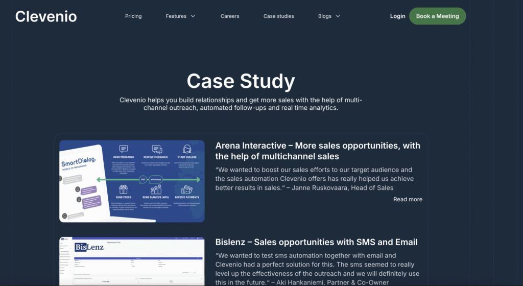
Below the longer case studies are the Clevenio customer testimonials written 100% by existing customers.
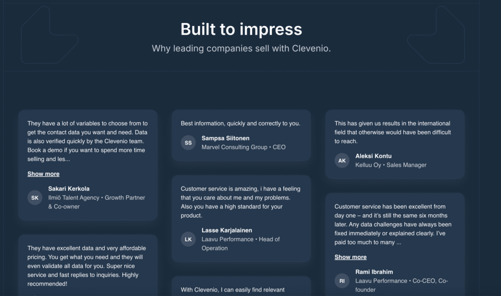
What I love about Clevenio’s page is that they don’t focus too much on the features of their tool, but rather they focus on the benefits and results that their clients achieved. Readers can skim through different stories and comments.
Here's what Clevenio's CEO, Aleksi Halsas, thinks about the importance of having frech testimonials.
–– When we can show the doubters testimonials from happy customers, we can actually change the whole tone of the conversation. Most people get very interested in what we do, when they see a comment from someone from their industry saying what great benefits they've got by using Clevenio, Halsas explains.
This is a great way to design your testimonial page. You don’t have to focus on the features of your product; rather, focus on how it will solve your audience’s problem.
Read more about how new companies need testimonials.
6. HubSpot Customer Testimonial Approach
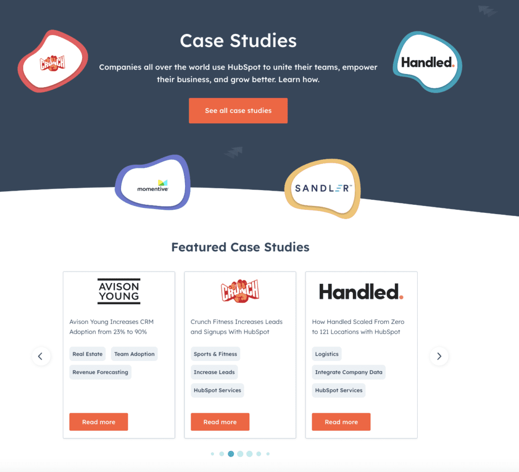
HubSpot has taken a different approach to its customer testimonials page. On the primary "Case Studies" page they highlight a few featured case stories, and below they elaborate on what kins of results customers get on average.
If one wants to see more case studies, they get to filter relevant testimonials in the Case Stories Directory. One can filter based on industry, company size, and HubSpot product.
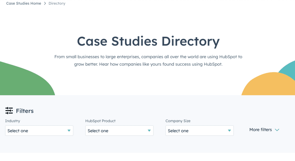
This is a smart move for a company as large as HubSpot that offers multiple solutions for various business needs.
HubSpot makes the customer testimonials brand-led rather than personal. You can't see a single customer's face on the page. You'll only see personal quotes after opening an individual story.
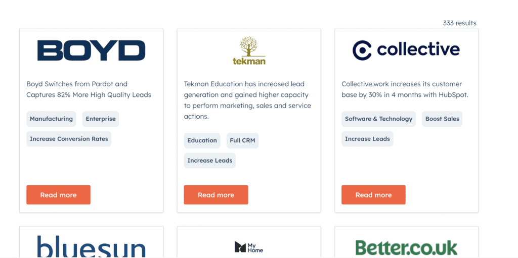
The case studies are very thorough and long read. Some are available in the text as well as videos and they specify if the customer switched from another service. This is a great way to drive sales and interact with potential customers. Those who are interested in video testimonials can watch a video while others can read the case study.
The testimonial page is well-designed and has a lot of graphics and vectors. When you use graphics and images, it gets easier for readers to skim content and get to the point quickly.
This is one of the best testimonial page examples out there designed to establish trust and provide relevant information for the customer's industry while ensuring social proof for the brand.
However, this is not very attainable for smaller businesses, and maybe not even smart. It works for HubSpot as they offer very elaborate and pricy solutions for large companies in all imaginable industries.
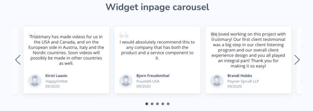
You can create your own customizable widget inpage carousel with Trustmary. The benefit of using Trustmary is that you can manage all testimonials with one tool. You can import them from other review sites, collect new testimonials AND add them to your site with one click.
Bonus: Trustmary
We may be a bit biased about this one, but we'll let you be the judge of that!
Customer references come in multiple shapes and forms:
- text reviews
- video reviews
- case studies
- customer satisfaction metrics like NPS
That's why we have decided to include them all. We've also made sure to include enough CTAs on the page so that the reader can immediately act on the urge after being awed by glowing customer reviews!
Check out our Reference page here.
All elements found on this page are available in the Trustmary app. Start creating your own page by adding existing reviews to your website.
Automate Testimonial Processes
There isn’t any single best way to create a brand customer testimonial page on your website. However, there seem to be specific trends, especially in the SaaS industry, as we can learn from the examples of leading SaaS companies.
It's not always beneficial to compare your business to a much larger company. You don't have to concentrate all your efforts on creating a grand collection of case studies in multimedia formats.
If your business is simpler and smaller, you can rest assured that less is enough: even a simple thing like a Google review widget makes a great difference!
Here's a winning formula for a simple and attainable testimonials page:
- Design your own customer testimonial page with a focus on the benefits of your product (instead of features),
- Showcase as many reviews as possible (before it becomes overwhelming)
- Avoid negative reviews, but don't censor!
- use real photos of your customers,
- provide both testimonial videos and text reviews,
- include enough CTAs
- Automate video testimonial processes
- Automatically publish new reviews and testimonials when you get them
- convert reviews into case studies, and
- design your testimonial page smartly to attract prospective customers.
- Import testimonials from LinkedIn and third-party review sites
If you would like to get started fast with creating your own testimonials page, try our free tool to add your existing reviews to your website
Further Reading:
- The Ultimate Guide for Collecting and Using Testimonials
- 15 Important Questions to Ask For a Testimonial
- Social Proof and Consistency: Why NPS Needs to Be Measured More than Once
- Customer Review vs Customer Testimonial Definitions
- 3 Best Examples of Testimonial Request Letters That You Can Copy
- 7+ Tips for Using Customer Testimonial Videos in Marketing
FAQ
Testimonials can be shown on any page, and it's wise to showcase them on pages where important conversions happen. Great placements include:
- Homepage
- Product pages
- Contact pages
- Testimonials pages
- Check-out (in online stores)
- Registration pages
What are the best testimonials?
The best testimonials are ones that highlight the benefits your clients have experienced while working with you. They are also authentic, personal, and include details that make the comments trustworthy. Often testimonial videos are also more effective than written testimonials.
Do testimonial pages work?
Testimonial pages are a great tool for building trust for your company. They truly work if you mind these details:
- Make sure potential customers find them. Include keywords for organic visibility and put the page in your navigation for visitors to find easily.
- Include enough CTAs to optimize conversions.
- Choose convincing testimonials to feature on the page.
- Make the page usable and offer valuable information.
How do I make a testimonial page?
Making a testimonial page can be as simple as copying and pasting some customer comments on the page. However, the easiest way to create visually pleasing and conversion-optimized testimonials pages is to use a tool like Trustmary. Start from adding your existing reviews to your website and move on to collecting effective written and video testimonials.