5 Testimonial Page Design Best Practices


When was the last time you looked at your testimonial page design with the eyes of potential buyers? You've probably spent ages fine-tuning your home page and then whipped up the testimonial page design in a hurry. However, you'll need to change that starting today.
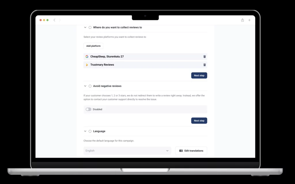
The easiest way is to add reviews to your testimonial page with a widget.
Let's go over:
- Best practices on creating a great testimonial page
- A few examples of existing testimonial pages and review pages
- Testimonial examples that work wonders
- How to create the most user-friendly web design for showcasing all types of social proof to win over website visitors' trust
5 Testimonial Page Design Best Practices
Have you ever seen a testimonial page on a website that actually did the opposite of what it was supposed to: prevented you from buying?
It happens.
That being said, keep in mind that embedding reviews on your website is a must, not a recommendation.
When the testimonial page's design isn’t top-notch, it'll increase the bounce rate instead of converting visitors into customers.
The fact is that 93% of customers read online reviews before making a purchase. Reviews are essential in establishing trust and generating leads and sales.
Pssst.. If you already have Google reviews from happy customers, you can embed them on your website with Trustmary – for free. Just type in your Google My Business location below and you can set it up in mere minutes.
No Google Reviews Yet?
Luckily, Trustmary's review campaign can help you get 5-star Google reviews. No AI generators, incentivizing reviews, or none of that fake BS.
If you've served your customers well, they'll be happy to tell you that.
One of our customers got 30 reviews in less than an hour.
Send your first campaign now by typing your Google My Business location below
However, customer testimonials are equally important.
Your testimonial page needs to:
- be mobile-user friendly
- be well-designed
- aligned with your brand visually
- include honest endorsement
- follow these next best practices to improve UX
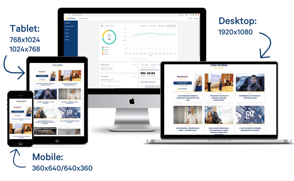
1. Mobile Responsive
Is your testimonial page mobile responsive? It should be.
The biggest reason for having a mobile responsive site is to ensure you have good rankings in search engines. Google has put a heavy emphasis on mobile usability as one of the ranking factors.
Additionally, more than 48% of all website traffic comes from the mobile device and is expected to grow in coming years. Not having a responsive testimonial page will theoretically mean that as much as 50% of visitors won’t be able to access it.
Responsiveness is the first thing you should aim for. When a testimonial page design is responsive, it should load and work flawlessly across all devices.
If you’re using a theme or template, switch to a responsive theme. If you have a custom-developed website, work with your designer(s) to make your website responsive.
Effects of Optimizing Responsiveness
Once your testimonial page is responsive, you'll be able to improve conversions and lower its overall bounce rate.
Any increase in bounce rate will negatively impact your website’s ranking in SERPs. That being said, it isn’t just about conversions, because a non-responsive testimonial page will impact your business in several ways.
Design Examples of Mobile Responsive Customer Reviews
You can implement Trustmary's testimonial and review widgets to your website and it'll automatically be scaled to whichever device your visitors are using.
Here are a few examples of how they look:
Customer Reviews Carousel
Songlifty has chosen to use an interactive widget, testimonial carousel.
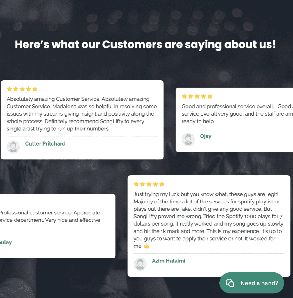
This is great for catching the browser's attention on an otherwise static page.
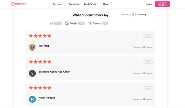
All Reviews in One Place
EasyParcel has a ton of reviews on third party sites. They've chosen to show to all visitors that over a 1000 people have reviewed them.
Any potential future customers can choose which review platform they deem to be the most trusted and browse more from that source, if needed.
If your customer reviews are currently scattered across many platforms, you can always import all reviews to Trustmary. Then you can easily use them also on your own website.
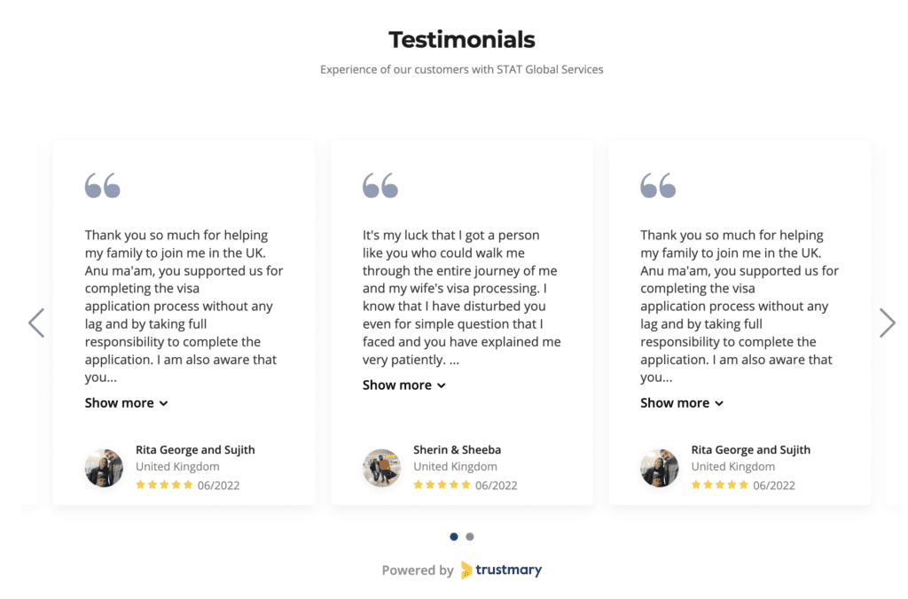
Testimonials That Make a Difference
STAT Global Services have been able to gather testimonials from their customers. These are a great addition to having only a few words or a star rating, as they give the reader a little more to relate to.
This significantly increases the probability of trusting the business in question, if people in your situation have already trusted them.
More great mobile-user friendly ways to embed customer reviews where they matter the most can be found from our extensive widget library.
2. Use White Space
White space is an important design aspect that you can’t ignore. White space improves readability and improves comprehension by 20% and helps develop clear relationships between different elements on your testimonial page.
Here is an example of how white space improves comprehension:
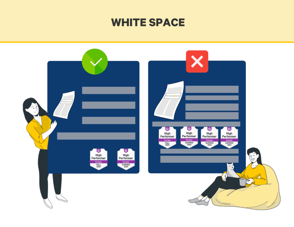
You get the idea.
A testimonial page design without enough white space will appear cluttered and messy. You need to ensure that your testimonial page has a lot of white space. Make elements clear and stand out from the crowd.
When you add white space, it actually helps prospective customers to focus on the customer testimonials and reviews on your website instead of trying to make sense of what they're seeing.
Once website visitors are able to make sense of the page, they will be able to
- Notice different reviews and testimonials on the page
- Get to know your product or service better
- Understand what they're reading
3. Use Numbers
Do you use numbers and digits on your testimonials page and in headlines? You should because numbers, percentages, and statistics stand out from the crowd.
Instead of writing:
“Mr. ABC shares his thoughts on our product.”
You should write:
“Mr. ABC shares how he reduced 10 pounds with our product.”
You can’t resist clicking the second headline even if you don’t want to lose 10 pounds. This type of headline provides you with instant results. It's exactly what you should incorporate on your own testimonial page as well - tangible social proof that your product or service works.
Add numbers and digits in headlines and sub-headings that are relevant to your primary audience. The numbers should be compelling and their intention is to make readers click and read the review. We also highly recommend adding these types of customer testimonials as close as possible to a relevant call to action button.
However, don’t use a number in all the headlines, but rather you should mix up using numbers with the core benefit of your product. The core benefit should be clearly visible in the heading. Address the major problem that your product solves. This will boost conversions significantly.
Number of Reviews Matters to Search Engines
As Google aims to provide its users with the most helpful information possible, having reviews embedded on your website can now really make or break your business.
Were you aware that Google results now showcase the overall star rating your business has?
Alongside with this nifty little star rating info, it also shows:
- Number of reviews
- Possibly some features or comments about you

It's called the review snippet. By using Trustmary's review widget on your website, you can automatically get this indexed in Google.
All in all, it's worth your time to focus on getting a high rating and as many five star ratings as possible, to stay relevant in Google's eyes as well.
4. Use Visuals
Visuals are an important element of any testimonial page design. Statistics show that over 91% of consumers on the internet prefer visual content over traditional content (text). This is the reason why you should use as many visuals as possible in your testimonial page.
Visual content can take any form ranging from images to videos to photos and more. You can even convert ordinary text into visual content by adding visual elements to it.
A blank testimonial page that has nothing but text won't look nice. In addition, it probably won't appeal to your audience either. Nobody likes reading walls of text.
Here are a few ideas to incorporate visual social proof content on your testimonial page:
- Distribute your testimonial page into different sections and use each section for one type of testimonials like text, videos, etc.
- Use video testimonials as much as you can.
- Use real photos of the customers with their reviews. This will make the page visually pleasing and credible.
- Use images and buttons on the testimonial page. When you have to write a lot of text, convert some of it into an image and publish it. This will keep a good mix of text vs visual.
5. Spotlight
Spotlight approach is a great way to boost conversions on your testimonial page and it is also a user-friendly testimonial page design technique. It improves UX because you provide visitors with the best and most appropriate review up front.
All you have to do is highlight one review at the top of the page to get user attention. You can spotlight one review from each category too.
In case you have many ideal customer profiles or segments, you can, for example:
- Highlight one testimonial from each main customer group
- Change the testimonial in the spotlight based on who visits the page (by using UTM tags)
- Use video testimonials to increase relatability
The first option doesn't require as much technical know-how, but the latter will likely be more effective. Website personalization is a huge factor in ecommerce and it's becoming more popular on all websites.
Pro tip: Highlight the customer's problem in the heading of the customer testimonials.
Testimonial Page Examples
Let's go over some real-life examples of great testimonial design.
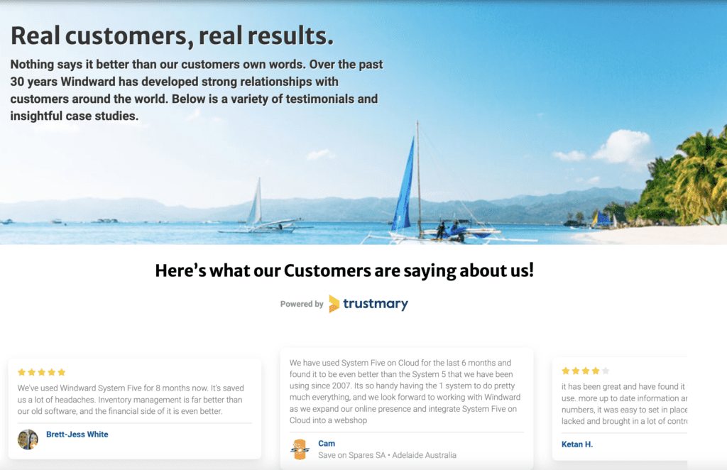
Improve Your Mobile Responsiveness
First of all, track where your traffic comes from! Google search console and Google Analytics are great ways to figure this out.
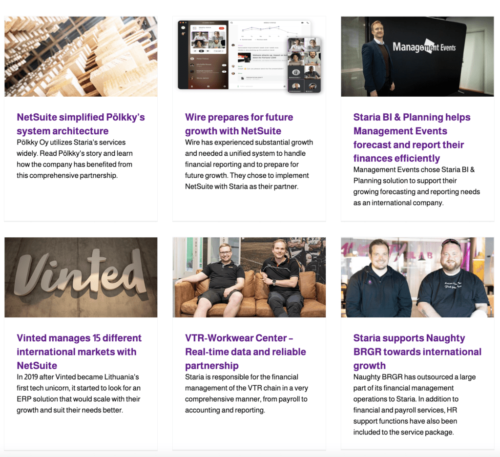
Windward Software has made their site mobile responsive. Their testimonial page is easy to browse even with your phone.
They've included many types of testimonials and even added some visual interest by adding an inpage testimonial wall. Below that, you can find their more extensive case stories.
Great Example on Using White Space
See the following testimonial page by Staria. It uses a lot of white space. All the testimonials are separated by white space. Scrolling through the page and reading content is extremely easy.
This is what exactly you should try to do with your testimonial page.
Make Customer the Hero – Spotlight Technique
Always highlight the story of your customer. This establishes trust in the viewer, but only if they can actually relate to the person on the video testimonial. Let the happy customer say a few words about who they are to increase the chances
Here is an example by Codeacademy.

One review is highlighted at the top. If you visit this page, you can’t resist clicking the spotlight video review because it’s so prominent and attractive that you can’t ignore it.
This is what exactly you have to do with your testimonial page. Use the spotlight technique to grab attention.
Conclusion
No matter how you design your testimonial page and what technique you use, make sure it aligns to your business strategy and values. The page shouldn’t look alien.
It should still look a part of your website so it must follow the same theme and pattern.
This alignment is essential. And also using the best practices of design!
Once you have designed a great testimonial page, you then need to tweak it further for improvements to boost engagement and convert customers faster.
FAQ
How do I create a testimonial page?
Create a new landing page for your testimonials! Place it close to your pricing page tab, as people look for more social proof before making the final purchasing decision.
You'll get the best impact, if you set social proof popups to be shown while someone is already browsing your pricing.
What do I have to include in my testimonial page?
Add endorsements in many different formats to establish trust! Different formats influence different people differently. Try to include:
- Reviews from all sources (Google reviews, Facebook reviews, G2, Capterra, ...)
- Logos of most known customer companies
- Customer reviews
- Client quotes (with pictures of the customers!)
- Audio clips from customers (aka audio testimonials)
- Video testimonials
- Case studies
- Third-party certifications
- Number of users, downloads, subscribers,...
What are the best practices for creating the best testimonial page design?
Start by analyzing what type of social proof content you have already. After that, focus on:
- Ensuring mobile responsiveness
- Using white space
- Using numbers
- Using visuals
- Making the client the hero of the story
After you've covered the basics, you can start optimizing the page layout even further by doing A/B testing.