5 CTA Button Examples to Boost Conversions


Call-to-action (CTA) buttons are small but mighty tools for driving conversions on your website.
A well-designed CTA button can encourage visitors to take desired actions, whether that’s making a purchase, signing up for a newsletter, or downloading a resource.
Here are 5 effective call-to-action button examples that can help you boost conversions.
What Is a CTA Button?
A Call-to-Action (CTA) button is a clickable element on a webpage designed to prompt an immediate response or encourage an immediate sale. It’s often used to convert visitors into leads or customers.
These buttons are typically highlighted with a distinct color, placed strategically on the page, and use persuasive text to compel action.
What Are Some Different Types of Call-to-Actions?
Different types of CTAs serve various purposes depending on your business goals. Here are some common types:
- Lead Generation CTAs: Encourage users to provide their contact information (e.g., “Download Now,” “Get a Free Quote”).
- Form Submission CTAs: Direct users to complete forms (e.g., “Sign Up,” “Join Us”).
- Read More CTAs: Lead users to more content (e.g., “Learn More,” “Read the Full Article”).
- Social Sharing CTAs: Encourage users to share content on social media (e.g., “Share on Facebook,” “Tweet This”).
- Purchase CTAs: Prompt users to buy a product or service (e.g., “Buy Now,” “Add to Cart”).
For more effective strategies, consider these examples tailored for demo calls, free trials, product offers, and social media engagements to maximize user conversions and engagement.
Why Do Effective CTAs Matter?
Effective CTAs are crucial because they guide users toward completing desired actions on your website. They:
- Increase Conversions: By directing visitors to take specific actions, CTAs can significantly boost your conversion rates.
- Improve User Experience: Clear and compelling calls to action make navigation easier, enhancing the overall user experience.
- Drive Revenue: Effective CTAs can lead to more sales and revenue by converting casual visitors into paying customers.
Where to Use CTA Buttons on a Landing Page?
The placement of CTA buttons is vital for their effectiveness. Here are some strategic locations:
- Above the Fold: Place CTAs where users can see them without scrolling.
- End of Blog Posts: Encourage readers to take the next step after consuming content.
- Pop-Ups and Slide-Ins: Use these for attention-grabbing CTAs, like special offers or sign-ups.
- Landing Pages: Well-designed landing pages with clear and concise CTAs can enhance user engagement and drive conversions for specific campaigns.
- Product Pages: Direct CTAs like “Buy Now” on product pages can boost sales.
Principles and Best Practices for Creating CTA Buttons
Creating effective CTA buttons involves following certain principles and best practices to ensure they grab attention and drive action.
Here are some key tips:
1. Use Action-Oriented Text
Your CTA should tell users exactly what desired action they need to take. Use verbs that prompt action, such as “Get,” “Download,” “Sign Up,” or “Start.”
2. Create a Sense of Urgency
Encourage immediate action by creating a sense of urgency. Phrases like “Limited Time Offer” or “Act Now” can be very effective.
Additionally, you can use CTAs like "start free trial" to entice users to take immediate action without financial commitment.
3. Be Clear and Specific
Avoid vague language. Use a straightforward call to action to be clear about what users will get by clicking the button. For example, “Download the Free eBook” is better than “Click Here.”
4. Make it Visually Striking
Your CTA button should stand out on the page. Use contrasting colors to make it visually distinct from the rest of your content.
Additionally, consider incorporating a secondary CTA to guide users toward other engagement points, such as subscribing to email updates or exploring additional content.
5. Position Strategically for Your Target Audience
Place your CTA buttons prominently within your web page where users will see them. Common places include above the fold, at the end of blog posts, and in pop-ups.
6. Keep it Simple
Don’t overcrowd your CTA button with too much text or complex designs. Simplicity is key to making it easily clickable and understandable for your target audience.
7. Test and Optimize
Regularly A/B test different versions of your CTA buttons within various marketing campaigns to see what works best. Test variations in text, color, size, and placement.
8. Ensure Mobile-Friendliness
Make sure your CTA buttons are easily clickable on mobile devices, as a significant percentage of website visitors tend to read headlines and CTAs. They should be large enough to tap with a finger and placed where they can be easily seen.
9. Use First-Person Language
Using first-person language can make the action feel more personal. For example, "Start My Free Trial" can be more compelling than "Start Your Free Trial."
10. Highlight Value
Clearly communicate the benefit of taking the action. For instance, "Get Your Free Guide" emphasizes the value users will receive.
Instead of a chore, the user will think of the action as something they want to do.
Social Proof Makes CTAs Even More Effective
Combining CTAs with social proof can significantly enhance their effectiveness by guiding users through the customer journey.
Social proof includes testimonials, reviews, ratings, and user-generated content that demonstrates the value and credibility of your product or service.
Here’s how to integrate social proof with your CTAs:
1. Use Testimonials Near CTAs
Place customer testimonials close to your CTAs to build trust and encourage action. For example, a testimonial praising your product next to a "Buy Now" button can reassure potential customers.
2. Highlight Ratings and Reviews
Include star ratings or review counts near your CTAs. This can be particularly effective for e-commerce sites where product reviews heavily influence purchasing decisions.
3. Show Real-Time User Activity
Displaying real-time user activity, like "5 people are viewing this product right now," near your CTA buttons can create urgency and leverage social proof.
4. Use Case Studies and Success Stories
Link CTAs to detailed case studies or success stories. For example, a "Learn More" button could lead to a page showcasing how your product solved a problem for a customer.
5. Leverage Influencer Endorsements
If you have endorsements from well-known influencers, include these near your CTAs. An influencer's name or face can lend credibility and encourage clicks.
5 CTA Button Examples to Copy
Now, to the beef of the article: call to action button examples that you can use on your website.
In these CTA examples, we focus not so much on the language of the CTAs, but on the buttons or elements themselves. You can recreate these buttons with any text you like!
Most of these social proof CTA templates are available via Trustmary.
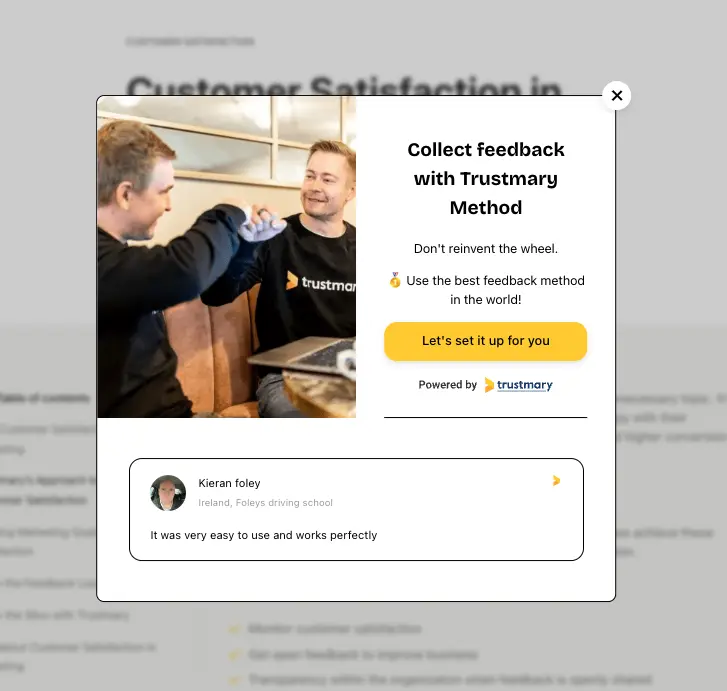
Call to Action Example 1: CTA with A Customer Review

In this example, the CTA button is followed by a Google review from an existing customer.
If the user is still on the fence about whether they should click the CTA, this testimonial can convince them to move forward.
A larger CTA element like this can work well in a blog post, as it allows for more context for the call to action. You can effortlessly pop this inside an article.
Example 2: CTA with Ratings

Social proof can also come in the form of wisdom of the crowds. Instead of one review or testimonial, include an average rating of your company.
You can get such a rating by importing your Google, Yelp, G2, and other reviews into Trustmary, or collecting original Trustmary reviews.
If you decide to collect more reviews, you can collect them to review sites as well.
In case Yelp business reviews are crucial for your business, redirect people to your Yelp profile after reviewing your services with Trustmary's review forms.
Example 3: Double CTA

Usually, it's best to just present one CTA button at a time. However, there are times when a double CTA makes sense.
Maybe your main CTA is a higher threshold action (such as "sign up" or "buy now"), and you want to offer something less intimidating for those who are not ready for the main conversion (like "learn more" or "download guide").
Highlight your main CTA more prominently, and include the secondary CTA button with a less striking color.
Example 4: CTA and Video Testimonial

CTAs with video testimonials (or any video!) are a great choice when you want to impress the user. A video testimonial adds even more social proof that written reviews, and otherwise well-chosen videos can help demonstrate your offering better.
Example 5: Pop-up CTA
Popup call to action is a good choice when you want to take that one last try to convert visitors into leads.
Exit-intent popups can include bold offers, as this is your last chance to capture that potential customer before they leave your site.
Conclusion
Call-to-action buttons are extremely important for any landing page or other marketing campaign.
Pay attention to the actual call to action, but also to the design and the button itself, as they have a surprisingly great influence on your conversion rates.
Adding social proof next to CTAs boosts their effectiveness by up to 20%.
To easily create CTAs with social proof, try Trustmary. Import your existing reviews or collect new ones, and start using them on your website with call-to-actions.
FAQ
What makes a good CTA button?
A good CTA button is clear, concise, and compelling. It uses action-oriented language and stands out visually on the page. Reviewing various call to action examples can help you understand how to craft effective CTAs that increase engagement and conversion rates.
How do I choose the right text for my CTA button?
Choose text that aligns with the action you want users to take. Use simple, direct language that conveys urgency or value.
What colors work best for CTA buttons?
Colors that contrast with your website’s color scheme work best. Common choices include bright colors like red, green, or blue.
Where should I place my CTA buttons?
Place your CTA buttons where users are most likely to see them, such as above the fold, at the end of a blog post, or near key content.
Should I use multiple CTA buttons on a single page?
Yes, but they should be consistent and not overwhelming. Multiple CTAs can guide users through different stages of the conversion process.