8 Landing Page Best Practices to Boost Conversions


Once you’ve generated inbound traffic to your site from different platforms, the next step is to convert as many of those leads as you can.
One of the best strategies to do this is through landing pages. Recent research shows that the average landing page conversion rate is 4.02%.
What Are Landing Pages?
Landing pages are designated website pages that customers “land” on when they click on ads or Call-To-Actions (CTA). Landing pages will often have lead forms that require customers to fill in their information in exchange for special offers or resources like e-books.
Good landing pages are designed with a single goal in mind: Converting visitors into leads.
Your landing page is only as effective as its design allows. If your landing page has a low conversion rate, chances are, you’re probably not applying landing page best practices.
But what are these landing page best practices? This post explains in-depth seven landing page best practices you should consider.
First things first: Everything starts with a great landing page builder. Your platform should be able to support all the features introduced below.
1. Write Irresistible Headlines
The headline is the first element of your landing page that visitors will interact with.
Therefore it needs to represent your landing page well and convince visitors of your page’s value. Here’s how you do it.
By the time your web visitors land on your page, you already know what solutions they are looking for. If you want a chance at grabbing your visitors' attention, then you need to sell them the benefit your site will offer from the headline.
According to the Nielsen Norman Group, users often leave web pages, including landing pages, in 10 to 20 seconds. In other words, you have only that amount of time to address their pain point in a way that pushes them to fill out forms, sign up, and make purchases.
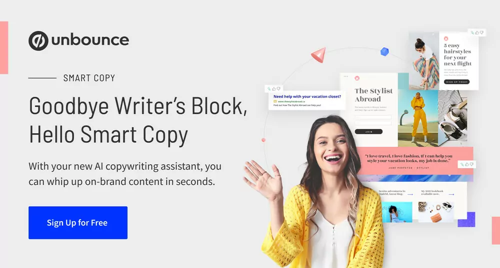
Example of Good Headline
Here’s a great example form Unbounce. The headline addresses writer's block, which any copywriter would be glad to avoid. As a result, a majority will be compelled to sign-up.
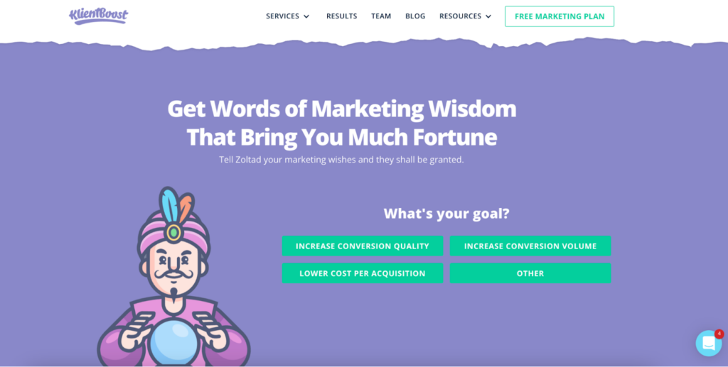
Personalize
Everyone loves a personalized message, so ensure your headline has a more personal approach and uses an active voice. That helps people feel like you're addressing them directly, encouraging more people to read on, as in the KlientBoost example below.
Make It Clear
Ensure your headline is clear and makes sense, too.
No one will keep reading if they cannot understand the headline. If you're not sure your target audience will understand your witty headline, then don't use it.
The goal is to communicate your desired action effectively. Use clear, easy-to-comprehend, plain language that sets the right expectations for your landing page.
‘Less is more’ should be your mantra when writing your landing page headline. You need to keep your headline short but with just enough information to keep the web visitors interested in learning more.
You can always use a sub-heading to add more information.
But while trying to keep your headline irresistible, do not forget to ensure that your headline matches the copy of the link or ad. Because they clicked on that link or CTA for a reason, a clickbait attempt will lower your conversion chances.
2. Add Images or Video Content
Since a landing page can't be overstuffed with information, you will need an image or video content that tells 10,000 words, literally.
The purpose of an image or video is to convey specific feelings to your target audience. Research also shows that people process visuals 60,000 times more than they do text.
For the images, you can either get your images from stock photos or your collection of company photos. Much thought goes into choosing the perfect image.
Choosing the Best Visual Content
Let’s look at which aspects you need to consider when choosing the best visual content for your website.
Understand Your Audience
First, you need to understand your target audience. This way, you can determine the image that will help you communicate more effectively to that target audience
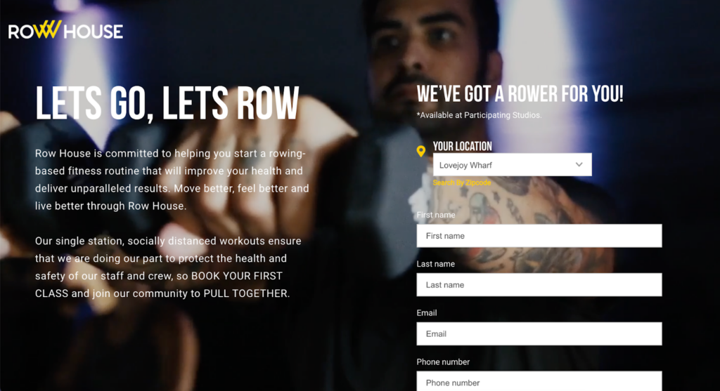
For instance, if your target customers are C-suite professionals, the image should have people who wear formal attire. if you’re targeting creatives, then the image should have flexibly dressed people.
Let’s look at a practical example. Notice how the Row House landing page uses a background image of someone working out. The background perfectly represents their target audience.
Consider Image Size and Dimension
The other factors you need to consider with your images are size and dimension. An image with a large size and dimension can reduce your landing page's load times. The slower your page is, the lower your chance of a conversion.
To avoid this, use images below the 1000 range since most websites are 900-1200 pixels wide on desktops. You can use tools like Tinypng to compress your images before uploading. Also, ensure your landing page images have the alt tag. The alt tag offers descriptive text about your image for viewers who can't see the image, as shown in the example.
Leverage Videos
Videos help you convey content in a universally compelling way that images and text can't. Statistics show that video content on landing pages could potentially boost conversion rates by 80%.
However, with video content, you have to ensure that, as compelling as it is, it doesn't distract web visitors from following your desired action.
Ensure you use them in a more complementary way. For instance, you can have video testimonials that will encourage visitors’ action.
3. Write Powerful and Engaging Copy
It won't matter how well-designed the other factors on your landing page are if your copy isn’t powerful or engaging.
Unless your copy speaks to the visitor directly, your landing page will have a high bounce rate. To avoid this, ensure your copy is clear and concise to guide your visitors to your desired action.
So, avoid using buzzwords, and use shorter digestible sentences. Also, include white spaces and more bullet lists. These will ensure the copy is easily scannable. The shorter it takes to understand the copy, the simpler it is to get the reader's attention.
Example of using engaging copy
This Inkling landing page is an excellent example of a page with engaging, well-formatted, and well-written copy.
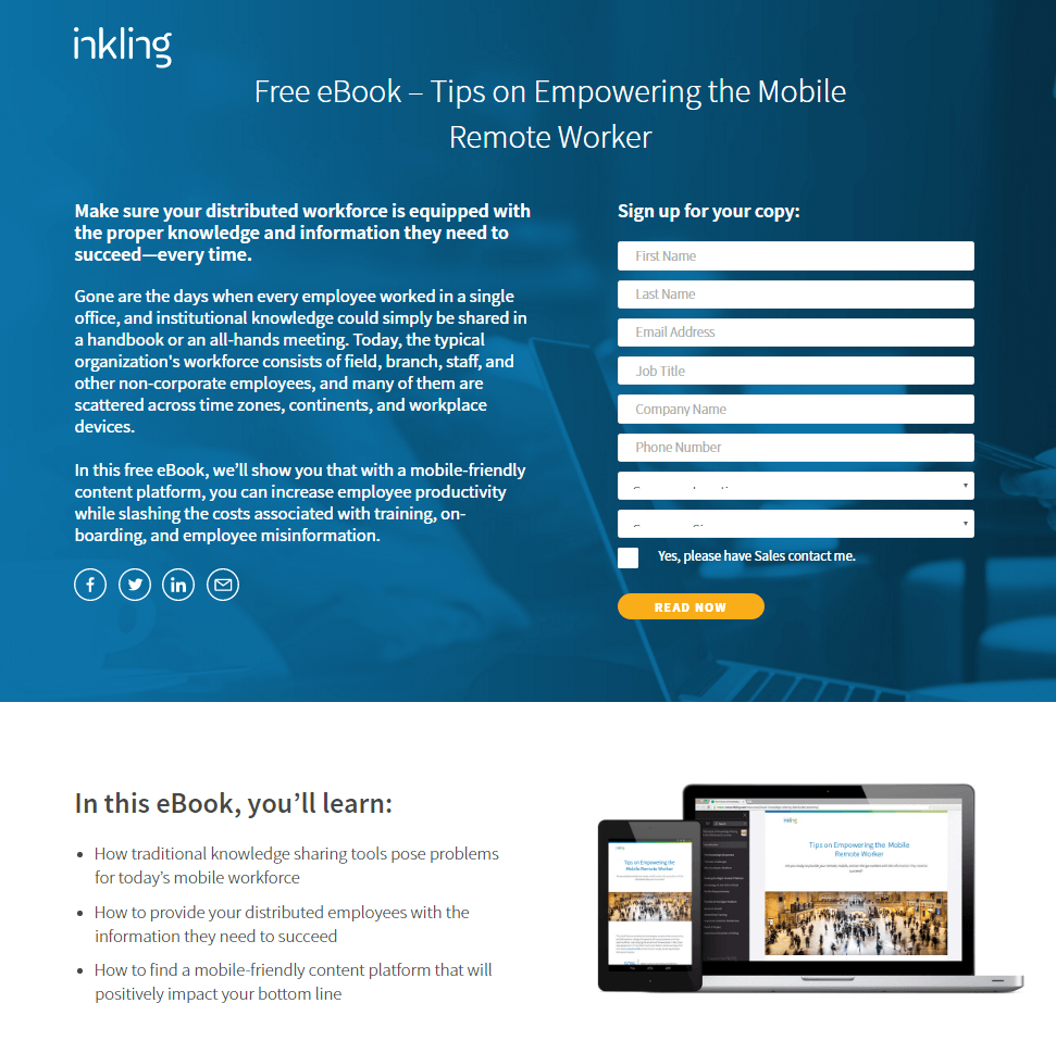
What makes this effective is that it speaks directly to the visitor using conversational language and pronouns like "your" and "you". That will go a long way in ensuring your visitors feel included, which equals higher conversion rates.
That’s an idea worth copying!
Finally, collecting feedback before your landing page copy goes live is always a good idea, especially from someone who doesn't understand what you provide or work in your field.
For instance, say you’re selling manufacturing web design templates. Ask feedback from someone who doesn’t work in the manufacturing sector.
Why?
If someone who knows nothing about manufacturing can easily tell you what your landing page is about from your copy, then it means even your target audience will.
4. Create a Better CTA
Your CTA buttons are the most crucial elements of your website.
They are the instructions you give to your landing page visitors. As a result, it holds much influence over your conversion rates.
To get the most out of your CTAs, you must ensure it stands out on your landing page and is easily understandable.
There are a few ways you can ensure this.
Tips for Creating better CTAs
- Use a vibrant color that contrasts your call-to-action button with other elements on the page.
- Spell out your desired action to the visitors. If you want them to download an e-book, use action verbs that also create a sense of urgency, like "download now" or "get it now."
- Keep it short. Your CTA copy should be less than five words.
- Add white spaces to avoid crowding the area where you position your call-to-action button.
- Position the button where the reader's eyes will go by following the flow of your landing page. That could be the right of your copy or right below your copy.
Examples of Great CTAs
The CTAs on this Wordstream landing page are good examples.
- They’re in a button,
- a different color that makes them conspicuous, and
- have short appropriate copy.
- The buttons are also strategically positioned right after the headline and after the form.

Finally, always ensure you conduct A/B testing on multiple designs of your call-to-action button and copy. That will help you settle for a CTA button that works best, which will increase conversion rates.
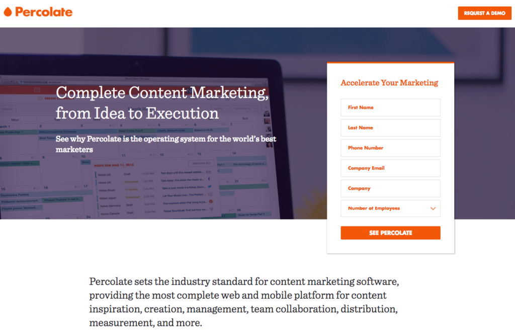
5. Place Lead Forms Above The Fold
You must ensure that your lead forms, like any other crucial information, remain above the fold.
Keeping the lead form "above the fold" simply means ensuring that the lead form is in view as soon as someone opens the page.
Your visitors don't have to scroll to the bottom to find your form.
Example
This Percolate landing page is an excellent example of this. The sign-up form is among the first elements on the landing page.
You could also go for a design where the landing page form scrolls with your visitors as they scroll down the page.
That means it will constantly be accessible and visible despite the user’s position on the landing page.
6. Include a Desirable Giveaway
People love gifts. By including a desirable giveaway, you’ll encourage more people to follow your desired action.
Moreover, people will give you their details like contact info or email address in exchange for a good e-book or discount, which you use to improve your marketing efforts.
Remember to make sure that the giveaway you offer is relevant to your target audience. Also, ensure it’s worthwhile. It should be something they wouldn't get for free and something that gives them value.
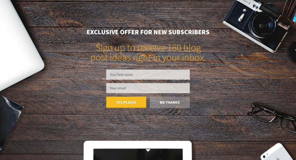
The following example …
But if your potential customers are digital marketing experts, then you could offer them free access to your gated content or guides.
The goal is converting your landing page visitors into customers. Getting their email is the first step to take to reach this goal.
7. Build a Mobile-Friendly Landing Page
Statistics show that more than half of website traffic comes from mobile devices. Also, according to the World Advertising Research Center, 72.6% of internet users will access the web only using their phones by 2025.
Therefore, you must ensure that mobile users, too, have a good user experience.
Tips for Ensuring Good User Experience
- Ensure your landing page is well-optimized and responsive. This way, you are not leaving the possibility of customers converting to chance because your visitors can access your landing page from any device.
- Conduct multiple tests across various browsers, including Chrome and Chrome alternatives, and devices. This is to avoid having elements falling off when viewed on smaller mobile phone screens. In addition, ensure there's proper text and imagery formatting.
- Keep your copy, buttons, and forms towards the center of the full-size page. This way, nothing falls off the page when your landing page design shrinks or stretches, depending on screen sizes.
8. Implement Widgets
Different widgets can significantly boost your landing page conversion rates. Widgets can offer additional information, visual social proof, interactive experiences, a sense or urgency, and much more.
Here are some widget ideas that you could try on your website:
- Testimonial widgets
- Chat widgets
- Survey and poll widgets
- Timer widgets
- Popup widgets
In Closing
A well-designed and effective landing page is one of the key strategies to achieving your conversion goals. Building one for your site requires following general but crucial landing page best practices.
This post discusses seven of them, which you can use as a starting point.
- Write compelling headlines.
- Add images or video content to your landing page.
- Write powerful and engaging copy.
- Create better CTAs.
- Place lead forms above the fold
- Include a desirable giveaway.
- Build a mobile-friendly landing page.
Additionally, don't forget to utilize social proof like reviews and video testimonials.
Follow these landing page best practices today and build a high-converting landing page.
This article was written in collaboration with Lform Design.