How to Design an Effective CTA Button that Enhances Conversions


A CTA button is a critical element of your website. It tells website visitors what to do, and gives them directions through the buyer’s journey.
Failing to use the right CTAs may result in site traffic loss and revenue. If your customer is not sure what to do next, chances are, they will bounce off and head over to your competitors.
In other words, if you want to enhance your website conversions, you need to create an effective CTA button.
You will learn CTA best practices from this guide. But let's cover some of the basics first.
What is a Call-to-Action Button?
A Call-to-Action (CTA) clickable button, is a text box designed for visitors to interact with your website. CTAs guide users toward your goal conversion.
So, a CTA is that part you want people to click so that they can take the action you want them to take. Here’s an example of a CTA button in action:
Good CTAs guide users through your marketing funnel, giving your website users clear instructions on what to do next. Together with other website elements, like social proof and customer reviews, CTAs are key to transforming leads into customers.
You can use CTA buttons in various areas on a website and your landing pages. For instance, you can place them on your homepage, blog pages, offer subpages, forms, or pop-ups.
Some common types of website call-to-action buttons include add-to-cart, download, and free trial registration buttons. The last type is presented in a screenshot below from Xero’s website. See the green buttons below:

You can use CTA buttons to get your website visitors to do other things, too. For example, if you want to gain Instagram followers, you would place a ‘Follow Us To See More,’ or a similar CTA. You can have Subscribe, Sign Up, or Join CTAs as well, depending on your page’s goal.
You will find that there are many CTA button designs you can use. However, you should be strategic about choosing your designs. Depending on your goal conversion and your website style, buttons can differ in color, style, and size. To ensure results, ultimately, your site’s CTA has to be clear and should stand out.
7 Tips to Create a CTA Button that Converts
Now that you’ve learned what a call-to-action is, let’s go over CTA best practices that can help enhance conversions.
1. Experiment with the Right Color Choice
To design an effective CTA button, you need to experiment with the right color choice. Your color choice depends on your website’s color scheme. As a rule of thumb, contrasting button colors work best to help your CTAs stand out.
To achieve high contrast, go for a complementary color. A complementary color is the one opposite to your website’s dominant color in the color wheel. As part of CTA best practices, use triadic colors, too. You’ll find your website’s triadic color after counting three steps from your dominant color in the wheel.
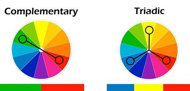
So, if your site color is navy, like the website below, a good striking color for your CTA buttons is yellow (its triadic color). Customers who want to start a free trial will easily spot the yellow button against the navy background.

Another strategy to use is color psychology. Marketers and UX designers know that different colors elicit different emotions. Here are some common notions associated with several colors:
| Color | Association |
| Red | Red is the color of blood. We associate it with energy, speed, and strength, but also with love, danger, and anger. |
| Orange | Orange communicates happiness, creativity, and enthusiasm. The color represents the in-between red and yellow–the speed and joy. |
| Green | Green relates to nature. The color symbolizes growth, freshness, safety, and stability. Green is usually associated with recycling and eco-friendly products. |
| Blue | Blue symbolizes trust, wisdom, confidence, and truth. It’s the color of the sky and also represents calmness and nostalgia. |
| Yellow | Yellow, the color of the sun, is associated with good energy, happiness, and warmth. We see yellow as a playful and cheerful color. |
| Purple | Purple communicates power, luxury, royalty, and wealth. It is identified with creativity, energy, and stability. |
You can choose a color depending on how you’d like your website visitor to feel when they see your CTA button. For instance, if you’re a company that sells eco-friendly products, you might want to use a green CTA button to emphasize your environmental advocacy.
2. Use Action-Packed Text
Using action-packed text for your call-to-action buttons is another one of many CTA best practices. Forget about boring lines, and write something that will encourage readers to take action. Use active voice and compelling action verbs like ‘get,’ ‘download,’ ‘buy,’ ‘sign up,’ and ‘try’ followed by the copy relating to what you offer.
Here are some good examples of text for effective CTAs:
- Book Your Spot
- Download Our Study
- Reserve Your Pass
You can ask someone else to read your CTA out loud before having it published on your site. If they understand what action to take after reading the CTA, it means your CTA is effective.
You can also use other words apart from your action-packed words to get your website visitors to take action. Check out these sample CTA buttons from Trustmary. In both, the company uses the word ‘free.’

The word ‘free’ makes it even more likely for the website visitor to click on the CTA button. Who doesn’t want a freebie, after all?
Another good practice is to use a CTA that highlights the positive results people will get if they click on the button.
For instance, the CTA button text ‘Jumpstart Your UX Design Career’ can encourage someone to take an online course. The CTA button text ‘Reach The Right Candidates’ could convince a company to post its job vacancies on a platform as part of its recruitment marketing strategy.
3. Make CTA Visible in Other Ways
You should make your CTA easy to see. Experimenting with the right color choice or fun fonts is one way to achieve this. Another way is to make your CTA button big enough for it to be noticed. Use a font size that people can easily read, too.
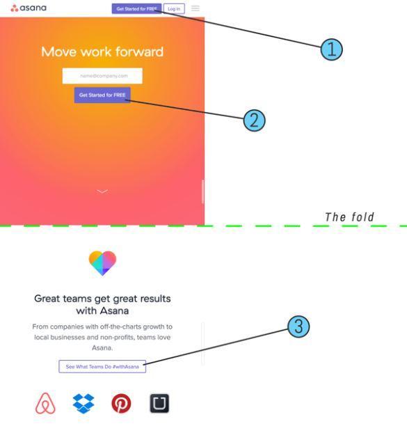
Check out the example below. Together with color contrast, the Asana CTA button makes for a strong CTA button.

But don’t just focus on the CTA button size. Make your CTA button visible, too, by setting it apart from other content on the page. A button buried in other text is easy to miss. If you surround it with white space, you can make it visible, too.
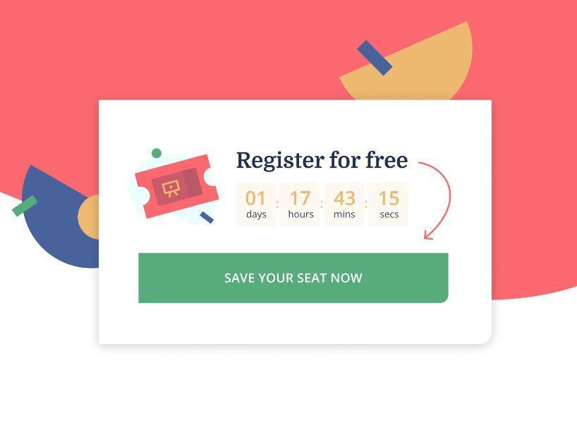
4. Create a Feeling of Urgency
You want your website visitor to click on your CTA button, not later but now. The best way to get them to do that is to create urgency, and by triggering that Fear of Missing Out. FOMO appeals to consumers' desire to not be left out.
To achieve FOMO, use words that prompt urgent action. The words ‘Now’ and ‘Today’ are common choices. With a countdown timer, you can further drill down into the urgency:
Use words that communicate the negative repercussions of not clicking on the CTA button now, too. For instance, ‘Sign Up Before The Price Increase’ tells the website visitor that if they delay clicking on the button, they could overpay for the service.
5. Choose Strategic Locations
The key is to put your button somewhere it will be easy to spot so you can catch your visitor’s attention right away.
You have to put yourself in your website visitor’s shoes. Not every website visitor will read the entire page. So, you should place your most important CTAs above the fold.
Any information that isn’t as important as the CTA button can stay below the fold. For instance, you can include your social media platforms there or your digital business card. This way, the extras won’t distract from the CTA button.
It also helps to check how visitors interact and engage with different elements on your site. For this, you can use a website heatmap.
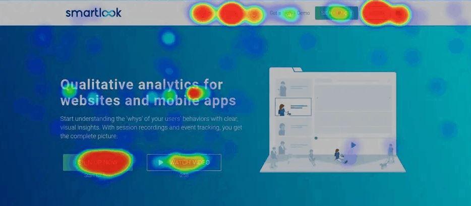
Essentially, the heat maps show the elements that users interact with the most (these are the red spots in the screenshot above). You can also learn how far website visitors have scrolled down your page.
So, if you have an important CTA that doesn’t get too red, it means it may not be in the right location, and you may have to move it (either that or you need to change your CTA copy).
Heatmap tools, like Hotjar, Smartlook, or LogRocket can help you choose the best locations for your CTA buttons.
6. Add Reviews Near Your CTAs
When you add reviews near your CTAs, or even inside the same element, you can increase the likelihood that people follow through with the action.
This is based on a phenomenon called social proof. If a visitor is hesitant to complete an action, they will feel encouraged when they see that other people are saying positive things about your company.
Several case studies have shown that adding reviews or video testimonials to a web page can significantly increase the likelihood of people converting to customers or leads.
7. Test the CTA Buttons
With A/B tests, you can learn which CTA buttons work the best. Think of it this way. Even the best CTA text won’t bring you conversions if your customers don’t like the color you choose. You need to find the right combination of elements to ensure an effective CTA.
In A/B testing, you launch two versions of a web page with traffic equally divided between them. Just make sure you don’t make too many changes in your second web page version. If you do, it might be difficult for you to determine which changes actually made a good impact on conversions.
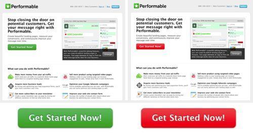
A/B tests can yield interesting results. A study conducted by Hubspot, for instance, revealed that out of the two versions of a page, 21% more people clicked on the red button than on the green button.
Other CTA variables you can test are button size, placement, text, and style.
The good news is, there are tools you can use for A/B testing. Trustmary, for instance, can help you A/B test different versions of your website. You’ll get reports showing you which CTAs, testimonials, reviews, and widgets work for your site and which don’t.
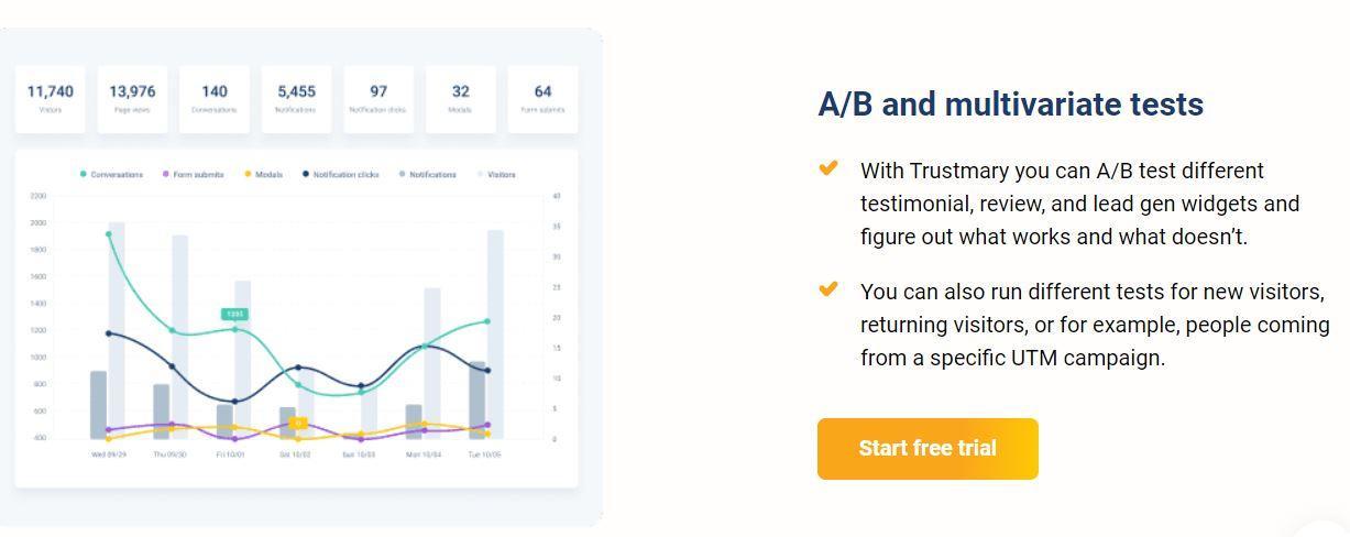
During the test period, the platform measures how many people visited each version of the page. The report will also show you how many users completed the desired action.
Make sure you still take into account the other CTA best practices once you get your A/B test results. For instance, if you find that a green CTA works best, don’t place it against a green background. You want the CTA button to be visible enough to make a positive impact.
In Closing
An effective call-to-action button helps you achieve higher conversions and a better return on your marketing efforts. Creating an effective CTA button isn’t as hard as it sounds. There are tips you can follow.
Experiment with color choices, and use action-packed text that creates a feeling of urgency. Make your CTAs visible in other ways and place them in strategic locations. Don’t forget to A/B test different button elements to learn which ones work best for your audience.
Improving your existing CTAs can help you connect better with your prospects. If you create great CTAs, you can expect those conversions to come trickling in. Good luck!
Written in collaboration with David Pagotto, the Founder and Managing Director of SIXGUN digital marketing agency.
FAQs
A CTA button is a clickable Call-To-Action button that asks users to perform an action. This could be signing up for a newsletter, buying a product, or downloading an ebook.
How do you create a CTA button that converts?
You can make a high-converting CTA button by:
1. Experimenting with your color choices
2. Writing an action-packed line
3. Making your CTA easy to spot
4. Creating a sense of urgency
5. Placing it in strategic locations
6. Testing different CTA buttons
How can CTA buttons help my business?
Great CTA buttons encourage your website visitors to take some kind of action. Without clear CTAs, users may find it difficult to see the route to signing up for a service or buying a product.
Placing an effective CTA on a pop-up form on your website is an easy way for the potential lead to give their contact information.
Ultimately, a CTA button is an element that can help your business to increase the conversion rate.