6 Lead Generation Form Examples (+How to Design Converting Lead Gen Forms)


Looking to get more leads from your website, but don’t know how? By looking at the following lead generation form examples, you'll be able to boost your conversion rates to a whole new level.
Lead generation form design is a key component in high converting websites. It’s even more important if you are trying to generate more leads.
In this article, we will:
- Run through the most important design principles that are important when designing a lead generation form and
- Introduce 6 lead generation forms that apply those principles to maximum effectiveness
Let's get to it.
What Is a Lead Generation Form?
Lead generation form is a web form that is built to capture potential leads contact information from your website. Most common lead generation forms are registration forms to an event, contact requests, users signing to a free trial, guide downloads or newsletter signups.
5+1 Key Elements of High Converting Lead Generation Form
There are 5 key elements in creating high converting lead generation forms. However, the last element can really make a difference in turning those leads to sales.
Let’s get to it.
1. Form Fields
Form fields and how they are shown are probably the most important aspects to take into account in lead generation form design.
The easiest way to improve lead generation form conversion rates is to remove most form fields so that the threshold of filling the form gets lower. This is a double edged sword though, as the quality of leads worsens with fewer form fields.
One clever way to generate leads with longer forms is to show one form field at a time. As the person commits to the first form field, filling the second form field is not that big of a deal anymore. These are called multi step forms.
Lead generation chatbots are something that do this very efficiently.
2. Copy Used on Lead Forms
The actual copy used is the second most important element in high converting lead generation forms.
Copy used refers to
- the title
- all the fields
- Basically, all written text you have on the form
You need to ask yourself, what specific information you are asking for. Only then you can create effective lead gen forms.
Below is couple of examples of how not to write copy to lead forms:
“Leave a contact request!”
“Subscribe to our newsletter!”
“Download our guide!”
Usually the best converting copy is something that actually communicates the value the customer will get, for example:
“Book a free consultation and get a free conversion rate optimization consultation!”
3. Clear Call to Action
Having a clear call to action (CTA) is one element which a lot of form designs are missing.
Remember, if potential customers don’t know what to do next, they won’t do anything.
Even though copy used near and as the CTA are important, they aren’t the most important factors.
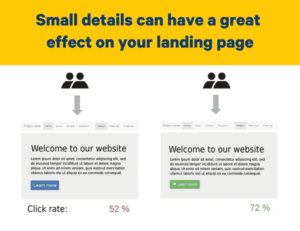
The most important thing in creating a clear call to action is to make sure it stands out from its background. In other words, the color difference between the button and the rest of the form.

4.Social Proof
Social proof is one of the most overlooked elements in high converting lead generation forms.
Social proof is a psychological phenomenon which explains why the actions and behaviors of other people affect one's action. To put it simply, people assume a behavior to be correct when they see others performing it. It’s equally effective to showcase what others (the masses) have already done.
If a potential lead is unsure if they should or should not fill the form, social proof is usually the factor that really moves the needle.
Easiest way to leverage social proof in lead forms is to highlight some happy customers that have done the same action the potential new lead is considering.
5. Context
Context of the lead generation form means the place the lead generation form appears.
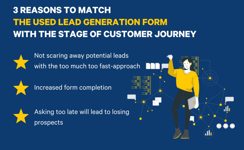
The key thing is that all kinds of lead generation forms don’t work in all places. The lead generation form used needs to match the stage the potential customers are in their buying process.

- Too big of an ask too early will scare potential leads away. (Possibly for good)
- A badly formed request won’t yield form completions and
- Asking to late will lead to losing prospects
When a potential customer is ready to buy, they want a clear form in which they can add all the relevant information to and press the submit button. Make the final hurdle easy to overcome.
However, if they are only considering converting into a lead, offer them the option to opt for more information or just an ebook.
This is incredibly easy to do with multiple choice questions with an optimized lead form.
6.(Hidden Fields)
Hidden fields are something that very few people use in their lead generation forms, but I would argue everyone should.
With hidden fields, you can gather different important information from your leads, without the lead having to manually submit them.
Landing page, referrer data, UTM tags…
All of this data will:
- Make it easier for your sales team to close the lead to a deal with additional accurate information
- Clarify which channels are actually bringing in the highest quality leads
- Which in turn allows you to double down on focusing on the right tactics that actually work.
6 Lead Generation Form Examples You Can Copy
Below you can find 6 different lead generation form examples that you can use as an inspiration for your lead generation form design. They’ll help you generate leads from those casual website visitors.
All of them are also available for free at Trustmary.
1. Inpage Lead Generation Chatbot Form
Inpage lead generation chatbot form is an easy way to lower the threshold of asking for more information on a website. Their trick is in asking each question from a potential lead one at a time.
Adding testimonials from a happy customer under the form will make a difference in the form conversion rates!
2.Popup Lead Generation Form
Popup lead generation form is great for gathering leads from multiple blogs. It works most effectively when launched to the bottom left of the website after a person has scrolled a blog or other relevant page for a while, for example 500px.
Remember to match the lead gen form copy to the page person is on when the form pops up.
3. Sidebar Lead Generation Chatbot Form
Sidebar lead generation chatbot form can be used similarly as the popup lead generation form. However, this results in a bit higher quality leads as the leads are qualified with more questions.
4. Basic Lead Generation Form
A basic lead generation form has all the key elements for high converting lead generation form, but nothing else. If you want to keep it simple or don’t know which one to use, use this.
5. Popup Lead Generation Form with Video Testimonial
Popup lead generation forms with video testimonials work a lot of times well as an exit-intent popup for high intent pages.
If you know customers on a specific page are very close to buying, for example, when they’re on a dedicated landing page, use this form as an exit-intent trigger. Help your target audience to make the first interaction.
The lead generation form combined with a high quality video testimonial will help increase conversions on those hesitant web users to actually leaving a contact request, instead of disappearing.
It’s the final push to convince them.
6. Full-screen Popup Lead Generation Form
Full-screen popup lead generation form is aggressive, but it also works.
Full-screen pop ups are annoying, but they also generate a lot of leads. You should usually use them as an exit-intent popup, not with other triggers.
Create High Converting Lead Generation Form in Minutes
With Trustmary, you can create high converting lead generation forms straight from ready-made templates in minutes, including all the designs above.
Other Form Tools
Trustmary's tools are centered around boosting conversions with social proof.
If you are (for some weird reason) looking for solutions that don't lean on customer reviews, here are some alternatives.
HubSpot AI Form Shortening
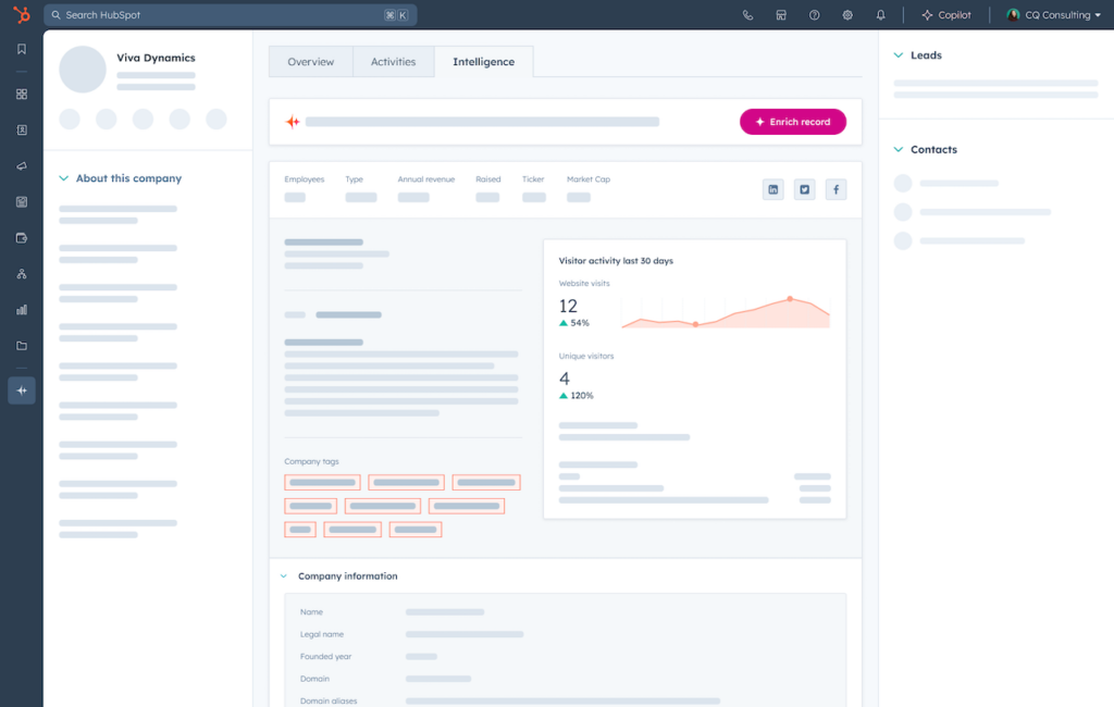
HubSpot's AI-powered form-shortening tool helps businesses capture more leads by intelligently reducing form fields while still collecting essential information.
The form-shortening feature automatically fills in information from HubSpot's Breeze Intelligence commercial database, allowing visitors to complete forms with minimal effort. This innovative technology works behind the scenes to enhance conversion rates by removing unnecessary friction from the lead capture process.

Key features include:
- Live form validation for immediate user feedback
- Drag-and-drop form editor for easy field arrangement
- Progressive profiling to gather detailed information over time
- Smart forms that change dynamically based on who is viewing them
- Seamless integration with HubSpot CRM for immediate lead management
This tool is particularly effective for businesses looking to increase form completion rates while maintaining high-quality data collection. By reducing the number of required fields and automatically populating known information, HubSpot helps you capture more leads without sacrificing data quality.
The form-shortening capability works across Marketing Hub, Sales Hub, Service Hub, Operations Hub, and Content Hub, making it a versatile solution for businesses of all types.
Further Reading
If you don’t have testimonials to use yet, we recommend going over these resources:
- The Ultimate Guide for Collecting and Using Testimonials
- How to Get Testimonials From Customers (With 7 Examples)
- 3 Best Examples of Testimonial Request Letters That You Can Copy
More in depth information about lead generation:
- The Ultimate Guide to Lead Generation
- 14 Best Tips on Lead Generation for Technology Companies
- 20+ Strategies in Lead Generation for B2B Business
- Chat Lead Generation: The Actionable Guide
FAQ
How to turn my website visitors into new leads?
Create a clear path for them to walk on. Guide them (gently!) towards the outcome you’d like to see happen, whether it be signing up, leaving contact information or downloading a guide.
Best tips:
- Create own forms for different purposes
- A/B test what works, and adjust accordingly
- Make call to action as clear as possible
- Add social proof near call to action
- Erase all distractions
- Follow up if they request it!
How can I create more interest in my product?
Try using chatbot lead generation forms to survey potential customers on their view. By using multiple lead generation strategies, you’ll quickly find effective tactics for your business.
Sign up for your free Trustmary trial to get started easily with all types of contact forms that work.
Does a traditional form still work as a lead magnet?
As we all get bombarded with dozens of discount code offers, advertising and email marketing, it’s best to try to stand out.
We’re not saying traditional won’t work, but we recommend trying out various tactics to capture leads.
How do I increase my lead form submission rate?
Eliminate the distractions! Ask one question at a time and pay attention to the overall design of the lead form.