Exit-Intent Popup Principles, Examples, and Hacks


A well-crafted and fully thought-through exit-intent popup is a powerful conversion rate optimization tool.
They turn visitors who are about to leave into leads and customers. And the exit intent technology has developed during the past few years.
This article introduces
- The idea of exit-intent popups,
- Explores exit-intent popup examples,
- Gives ideas for use cases, and
- Offers hacks that make you succeed.
How Exit-Intent Popups Work
Exit-intent popups are used for digital marketing on websites. They can be used on landing pages, blog posts, or checkout pages: basically anywhere you see fit.
An exit popup is the last resort with which marketers try to persuade a website visitor to convert before they leave the page.
As the name suggests, an exit-intent popup appears when exit-intent is detected.
When the website visitor moves their mouse away from the page towards closing the tab, it’s safe to assume that the visitor is about to leave the page.
This is the time when the popup appears and tries to get the visitor to complete an action before leaving.
You have probably encountered these popups numerous times. Some think they are a nuisance, but even then, one simply can’t deny their power.

How Do They Differ From Other PopUps?
In general, popups are pretty annoying. They distract our experience on the website and we have to click them away to continue using a page.
While this is frustrating for the user, it can be lucrative for the marketer.
However, I would argue that exit popups are among the least annoying popups, while also quite powerful. A win-win!
Let me compare different types of popups to illustrate my point.
| Popup | Trigger | Use case | Annoyance rate |
| Entry popup | Triggered when someone lands on the page. | When you want to highlight something to each and every page visitor, like a special offer, current news or events, etc. | 70/100 if it features something useful like a discount, I might consider buying if I know about the discount. 100/100 if it doesn’t benefit me at all, as it blocks the view to the website I wanted to look at. Think about those cookie and privacy setting popups… |
| Page scroll popup | When the visitor scrolls down the page for a set amount. | When you want to showcase something relevant to a visitor who is clearly into the topic, or trying to find more information, as they are scrolling down the page. Try: additional info, chatbot, contact request form. | 50/100 if it’s smartly targeted. Can be very useful. Extra points if it doesn’t block my view too much. |
| Timed popup | When the visitor spends a set time on the page, for example, 30 seconds. | A long time on the page signals interest in the topic, so there might be a hot lead right there. Shoot them with a lead gen popup. | 60/100. Kinda annoying if I’m trying to focus on something, but if it’s relevant and helpful, I’ll be happy about it. |
| Click popup | When someone clicks on a link. | Providing additional information, opening a calendar for booking a meeting, chatbot or live chat… Anything you promise with the link must be featured in the popup. | 20/100 because I expect something to happen when I click a link. Usually, I would expect to be moved to another page, which might make the popup a bit confusing at the first sight. |
| Exit popup | When someone is about to leave. | This is your last resort. Bribe the visitor with discounts or persuade them with superior benefits of your newsletter. | 0-10/100. I’m about to leave anyway, so don’t be afraid to annoy me. Actually, I’m happy if I get a chance for a discount. Other than that, I’ll just ignore the popup. The only thing that could make an exit popup annoying is its aggressiveness and if it wastes 1-2 seconds of my time. |
You can disagree with me on this one, but only after seeing the results that exit-intent popups have created.
Are Exit-Intent Popups Actually Effective?
Whether exit-intent popups actually work has a simple answer: yes.
According to different sources, the average conversion rate of a popup is around 11% or 3%. Some popups might go as high as 50%.
Of course, all this is dependent on the content of the popup.
Let’s see a couple more tangible examples of how effective exit-intent popups can be:
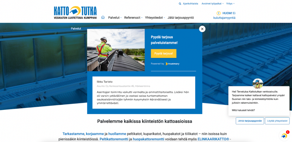
A simple lead generation popup that includes reviews from previous customers helps one of our clients get 62.5% more leads compared to pages without a popup.
Pay attention: This case featured a business that provides roofing services for businesses and organizations, not for individual consumers.
In other words, popups are not just for B2C companies. They have a place in B2B marketing, too!
Another example shows how an exit-intent popup with a discount code can lead to 37% more purchases.
It’s not surprising that a discount has such an effect. After all, someone who was considering a purchase will surely feel inclined to complete it with a lower price!
11 Use Cases for an Exit-Intent Popup
If you need ideas for your first or next exit-intent popup, here are 15 use cases that you can choose from.
1. Newsletter Signup
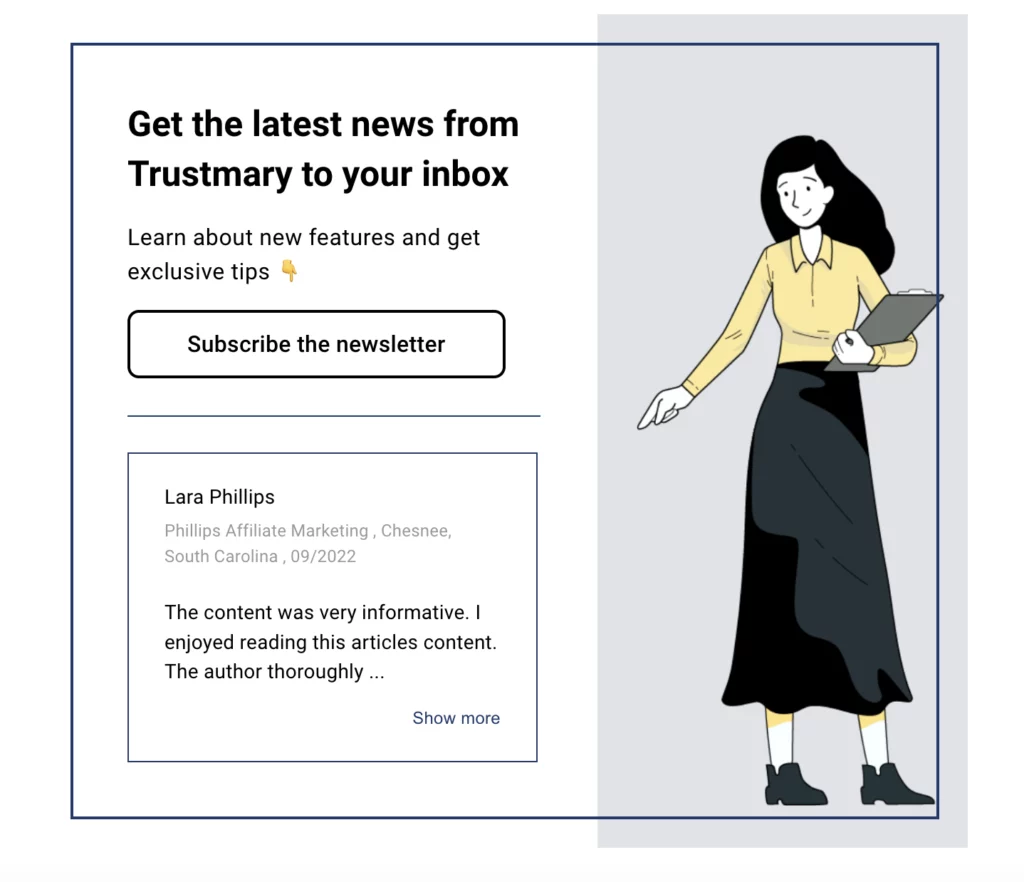
This is one of the most popular ways to use exit-intent popups and capture MQLs.
You can execute the idea with a call to action button or a popup form to collect visitor’s email address on the spot.
Notice the use of social proof with reviews from subscribers within the exit intent popup.
This is a nice way to convince people to sign up. Another great tactic is to highlight the number of subscribers.
2. Discount Coupon
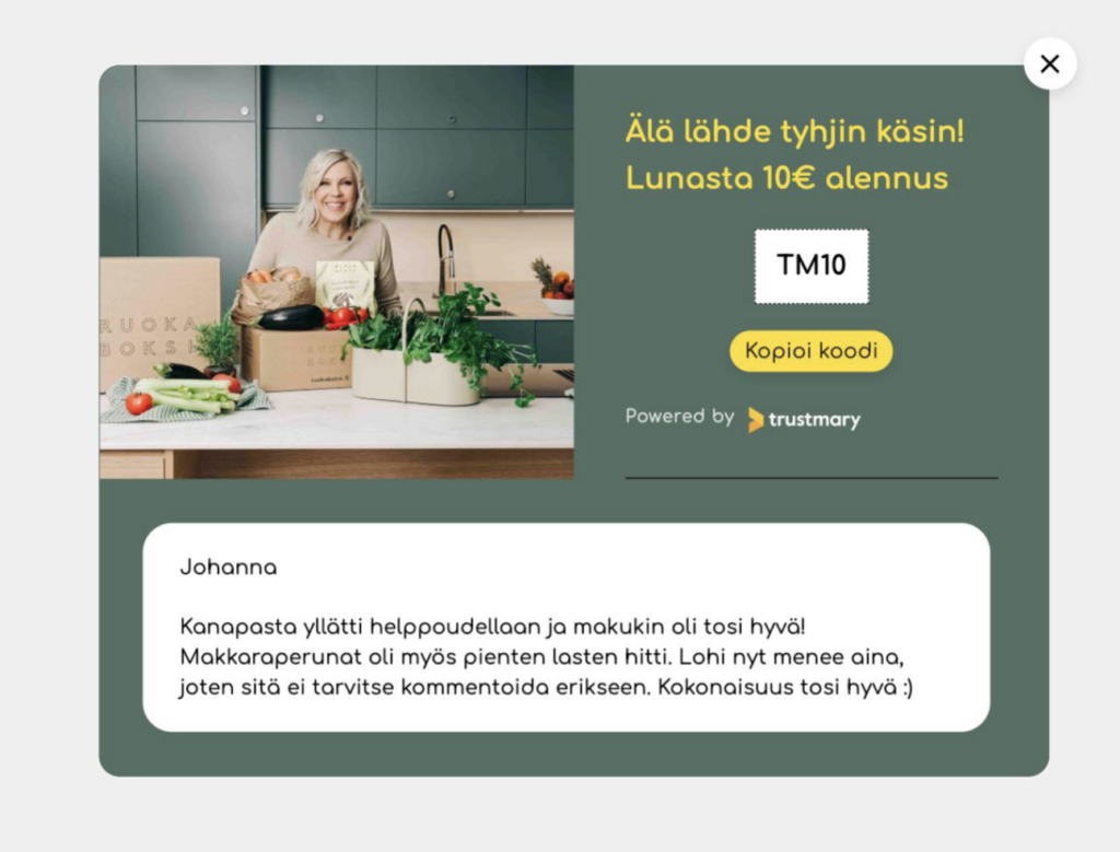
You might feel reluctant to give out discounts, but a discounted sale is better than no sale.
Our client Ruokaboksi experiemented with this tactic and learned that adding the pop-up with a discount code added purchases by 37%.
However, only use this, when you know they were about to leave from a high-intent page.
3. A Freebie
Who could resist a gift or freebie in addition to their purchase?
Many e-commerce stores use this tactic, but not necessarily as an exit-intent popup. Maybe you should start doing it?
4. Course Giveaway
If applicable to your business, you could offer a giveaway of an online course.
This way you get to showcase your expertise, and in the best-case scenario the lead is so impressed with your course that they want to hire you!
An exit popup is a great way to hook relevant visitors to convert at least to something. In this case, your expertise. You'll have a chance to stay top of mind!
5. Quiz
Quizzes are a fun and entertaining way to engage your leads.
Is it alluring enough to keep a visitor on the page? Maybe, maybe not. You could add to its attractiveness by adding prizes to it.
For some businesses, a quiz is a good way to educate the leads about products and services.
If the lead was about to exit because they were not sure what or why they should purchase, this is a way to help them decide.
Here’s how Neil Patel does it:
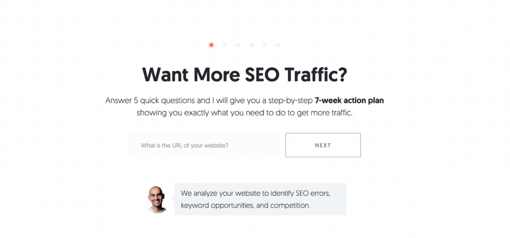
This is quite an elaborate popup and requires special attention. You wouldn’t want the lead to e.g. accidentally leave in the middle of the quiz.
6. Demo Offer
For software companies, offering a demo to a lead is one way to convert them.
This only works if your website visitors are highly interested in the product, and seriously consider a purchasing.
A short demo is your opportunity to make or break the deal.
7. Trial Offer
Another catch for SaaS companies: a free trial to target audience.
You might offer a free trial as a norm. It doesn’t have to be a special or unique offer (although it can be).
Sometimes it’s enough just to remind the visitors that there is, in fact, a free trial available.
Sproutsocial stands out with its exit popup with a left-side placement. Often, the popups are full-screen.
Notice how they create urgency with the popup.
8. Contact Request
Sometimes the problem with websites is that the website visitors did not find the information they were looking for.
In this case, a simple contact request form can help. The customer can easily let you know that you would like to hear more.
Remember when I told you about exit-intent popup success stories earlier?
One of them was a Finnish roofing company that showcased a simple popup with a review and a contact request CTA. They received 62.5% more leads with this popup.
9. Gated Content
One way to capture leads with popups is to offer a piece of gated content: free downloads that are actually not that free, as the visitor gives you their email address.
In order for this to work, the content needs to be highly valuable and relevant to the visitor.
This type of popup might work best on your blog or resources page. The visitor found this page because they are interested in the topic, and might be interested in more elaborate information, too.
If someone is on your front page or product landing page, they are probably more interested in discounts or getting in touch with someone.
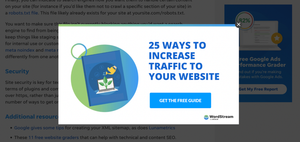
Here’s an example of gated content from WordStream. I was browsing a blog post about SEO, and they hit me with an exit popup that promotes a guide on getting more traffic.
10. Feedback Survey
If you can’t keep the visitors on your page, at least you can try to get them to give feedback on why they are leaving.
Once again, it might be a good idea to include a small incentive, like a gift card. Otherwise, it’s very easy to ignore the popup altogether.
11. Chatbot
Chatbots can have multiple purposes on a website. If you include it in an exit intent popup, it might be able to solve whatever issue caused the visitor to want to leave the page.
Above is an example of a simple chatbot that can be placed statically on a specific landing page. It can also be used as an exit popup.
Chatbots can be tricky to operate on mobile devices, so pay attention to that, when creating your chatbot.
Exit-Intent Popup Hacks to Try
No matter what you promote with the popup, there are some key things you should take into account in any case.
Always Include Call to Action
What’s the point of showing an exit-intent popup if it doesn’t include a CTA?
Imagine a popup with the text “20% Discount when you order now!”, but nothing to click on.
Or even worse: “Sign up for our newsletter to get the latest industry news!”, but nothing where to sign-up.
Oooookayyy…? And then what?
Always add a call to action that is easy to spot and use!
Target and Personalize
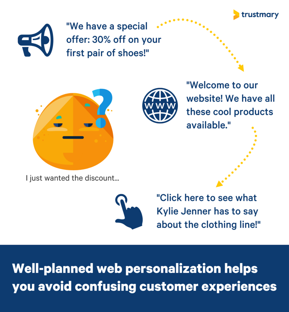
As we noticed earlier, visitors are super annoyed if they see popups that have absolutely no relevance.
Make sure that any popups you use are well aligned with the overall customer journey.
Show different content for people coming from different sources. You can do this by using UTM tags.
An example:
Scenario 1: Someone has found your page on Google because they are interested in your content. It would be a good idea to promote your newsletter with a popup!
Scenario 2: You promote your blog posts in a newsletter. One of the readers clicks on the link and lands on your page.
Would it make sense to promote the newsletter for this visitor?
Of course not. Do something else, like push for a meeting or free trial. This lead might be warm enough to take the action.
Website personalization like this is crucial for a smooth customer experience online.
Make It NOTICEABLE
Exit popups are your very last chance to convert the visitor. Your goal is to capture the attention of the visitor.
You can make the popups aggressive, because who cares! Those who hate it can continue leaving your page.
One of the basic marketing rules is to make the marketing message stand out from the surroundings.
Do this by using big letters, prominent colors, and engaging images. Don’t forget attention-grabbing headlines.
However, there are some things to be cautious about:
- Don’t deviate from your brand too much. Keep it stylish.
- Avoid flashing lights and fidgety elements. It’s tacky, cheap, and makes the popup inaccessible to some visitors.
- Make sure that the popup loads fast. Otherwise, the visitor is gone before they see it. Large images and special effects might slow it down.
Add Social Proof
Whatever you promote, it’s always a good idea to add a hint of social proof.
The best way to add social proof is to show reviews from happy customers. Trustmary is your choice when you want to add reviews to your popups easily.
Other ways to implement social proof are using numbers and word choices that imply you have a large community behind you.
“Join the 1000+ happy customers!”
“Take the quiz and see how you compare against the 150 people who took it before.”
Highlight Urgency
You want the visitor to convert fast. Creating urgency can help with this goal.
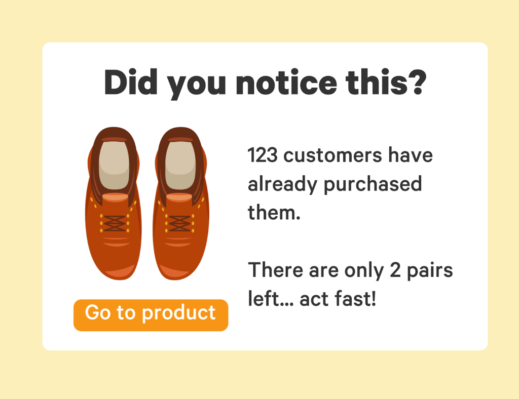
In e-commerce, a simple “2 pieces left” popup works wonders. You could even give a specific time, like 15 minutes, to use a discount code.
In other use cases, highlight your offer as a special, limited edition offer, or provide additional benefits for those who convert immediately.
Creating urgency doesn’t always mean an additional benefit. It can mean highlighting that the visitor can get your product or service faster and start reaping the benefits faster.
For example, you could wait to start using Trustmary when you have more time to look into it… Or you could start using it right now and immediately improve your website’s conversion rate.
Think about how many customers you lose each month that you could be capturing with Trustmary’s help!
Leverage FOMO
Fear of missing out is a real phenomenon that affects people’s behavior. It’s especially prominent in younger generations: millennials and gen z.
FOMO causes people to think that they lose something when they don’t follow popular trends.
It’s easy to see how it benefits B2C marketers. Viral products have high demand thanks to social media influencers.
However, FOMO has its place in B2B, too. Consider this example:
“500 people have read this case story. Do you want to miss out on the info that 500 of your competitors have?”
When expressed like this, who would want to miss out on industry info that others have already discovered?
A/B Test
Last but not least: A/B test your popups.
If you are still skeptical about if they’ll work, you can first test your page with and without a popup.
When (emphasis on when not if) you notice that exit-intent popups do increase conversions, you can start experimenting with different versions of the popup.
With time, you’ll be able to discover the most effective popup hacks for your individual purposes.
Creating High-Converting Popups with Trustmary
As you have seen before, exit popups created with Trustmary have brought actual results for our clients.
With Trustmary, you can always load your popups with social proof.
The popup builder is easy to use: just choose your favorite template, modify the colors and contents, add reviews, and set the URL where you want the popup to show.
It’s that easy!
You can also A/B test the exit intent popup to find out its true effects.
Our template library is constantly growing, so don’t be disheartened if your desired popup form is not available yet. Make a request and you might see it one day!
Conclusion
Exit-intent popups are becoming the standard practice in digital marketing. And why wouldn’t they?
There is basically no risk in using them (unlike in the case of some other popup types), and you certainly get benefits out of them.
We have gone through 11 different use cases for exit popups, and additional hacks for any popup types.
Now, you surely want to know how to get started with your own exit-intent popups.
With Trustmary, you can use various popup templates and make them your own. Add reviews from happy customers, which enhances the effect.
The popup types include:
- CTA popups
- Lead generation form popups
- Review popups
- Discount code popups
On top of all this, you can A/B test and discover the best-performing popups for your website.
Sign up for free!
Further Reading
- The Ultimate Guide to Lead Generation
- Introducing Lead Magnets and How to Promote Them
- Social Proof Popup Examples That Improve Conversion Rate
- Multivariate vs A/B Testing: Difference Explained
- The Definitive Guide to Optimizing Conversion Rate
- Widget Ideas for Marketers: Boost Conversions with Social Proof
FAQ
What is an exit-intent popup?
An exit-intent popup is a popup that is triggered when exit-intent is detected. This means that the website visitor is moving the mouse to close the tab. The purpose of the exit popup is to prevent visitors from leaving the page, and instead to complete a conversion event, like making a purchase or leaving a contact request.
Do exit-intent popups work?
Exit-intent popups really work! We have seen case examples where the conversion rate of a website increases by 62%. And even if the change is not as dramatic as in this case, you don’t lose anything with an exit popup. Even a tiny improvement brings more cash to your business.
How to create an exit-intent popup?
Creating an exit intent popup is easy with various tools that are available. In Trustmary, you can use any of our popup examples, customize them to fit your brand, add the right CTAs, and add social proof for extra effectiveness! Putting them up on your site is easy: just write the desired URL(s) to the settings.
How to add exit-intent popups to WordPress?
Adding popups to WordPress is easy. If this is your first Trustmary widget, first put the Trustmary tag on your website. Next, you create your popup in the widget editor, and lastly, write your URL to the settings. Voila: all set! It all takes just a few minutes.
Does exit intent work on mobile?
Trustmary’s exit-intent popups don’t work on mobile. In general, exit-intent popups can be applied to mobile devices, just with different triggers. The technology required is a bit different, as there is no mouse moving on the screen while using a mobile device.