Website Conversion Rate Optimization Checklist


Generating leads is tough.
Statistics show that 65% of businesses rate generating leads (and sales) is the biggest challenge they're facing. There is a lot that you can do to generate more leads and to improve lead quality but nothing is more important than Conversion Rate Optimization (CRO).
You can spend thousands of dollars on ads, SEO and email marketing, but if your website isn’t optimized for conversions nothing will move the needle.
It all comes down to how visitors are treated when they land on your website. Your website should have the potential to persuade visitors to ‘take action’. This is what CRO marketing is all about – optimizing your website to convert the maximum number of visitors into leads (better yet, customers).
Not sure how to do it?
The website conversion rate optimization checklist below will provide you with actionable techniques and strategies to take conversions to the next level.
1. Headline
The headline is the first thing that visitors see as soon as they land on your website. You have less than 15 seconds to grab a visitor’s attention because the majority of the website visitors won’t stay any longer than 15 seconds. That is, you should attract the visitor within 10 seconds, if you don’t – you lose the visitor.
It’s hard to make a significant difference with design, layout or theme. Instead, focus on a catchy and prominent headline. Statistics indicate that 90% of the visitors who read the headline proceed to read the rest of the content and will stay on your site.
Make your headline stand out from the crowd and it should have the potential to grab user’s attention instantly. When you have written your headline, you have done 80% of the work.
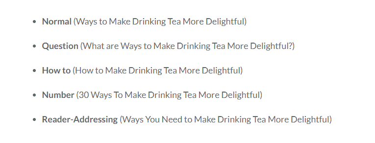
Here are a few examples of headlines you can use to optimize your website.

2. Copy
After reading the headline, the copy is the next thing your visitors will look into. Optimize your copy for conversions. Now this isn’t an easy task. Over 75% of businesses find it extremely challenging to optimize landing page copy.
Here are a few techniques to optimize your copy for conversions.
- Make sure that the copy is relevant to the headline. Any irrelevancy will lead to the visitor leaving your website.
- Put the conclusion or crux in the introduction of the copy. For instance, if you’re generating leads with a case study, add the results of the case study already in the introduction – right after the headline. This is essential: an average visitor spends 80% of the time scanning content above-the-fold.

- Write short paragraphs, use bullets and a lot of subheadings, and make the copy easy-to-skim because rather than reading the full text, people tend to skim online content. Research indicates that an average user only reads 20% of the content on a web page. Optimize your copy for the skimmers, not the readers.
- Don’t write for search engines. Write for humans. The moment your focus shifts to search engines, your copy is not likely to convert anymore.
3. Offer
What are the features of your products and services that make them extraordinary? Do they have the potential to convince readers to take action? Most importantly, how do they solve the problems of your prospective customers?
The offer should be relevant to:
- Headline
- The promise you made in the ad
- Copy
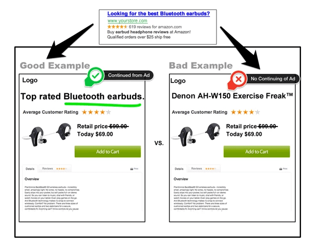
Any mismatch will ruin conversions. Here is an example of how the mismatch will turn visitors away.

Not only should the offer be relevant, but it should also provide added value. You might have a great offer, but if you fail to explain it clearly, the visitors will lose interest and leave.
Be clear in what you’re offering them. Stay focused on one, and only one goal. Pitch your offer by highlighting its benefits and your unique selling proposition.
4. Call to action
Call to action (CTA) is the most critical CRO element that makes or breaks the deal. If the headline, copy, and offer are all great but CTA is poorly written, visitors won’t be sure what to do next.
Here are a few tips to optimize CTA on your website.
- CTAs on a single webpage should have the same goal. For instance, you shouldn’t sell shoes and socks on the same page. It will only confuse the prospective customer.
- Create multiple CTAs with the same goal
- Add a CTA above the fold so that visitors see your CTA as soon as they visit the landing page
- CTAs should be descriptive and communicate the benefit to the reader clearly. For instance, ‘Click Here’ isn’t as descriptive as ‘Click Here to Get 14-Days Free Trial’. A good example would also be 'Sign up for the free Trustmary Automate!'
- Test different variations of CTAs and see what works best
5. Website design
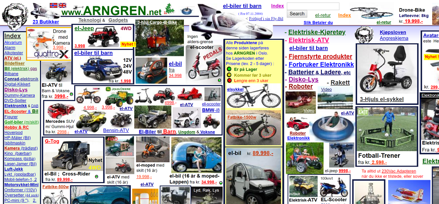
Your website’s design, layout and color themes are as important as the headline, copy and offer. A poorly designed website is the last thing that you need. If you land on this website, do you feel like buying something? Most likely not.

Website design consists of the color scheme and theme/template. Here are a few actionable tips and techniques to optimize website design for conversions.
- Keep your website as simple and fresh as possible. Don’t overdo it.
- Use a color scheme that is pleasant for the eye and that makes the text prominent and easy-to-read. The safest option is to go with black on a white background - it will never disappoint you in terms of conversion rate.
- Ensure your website has enough whitespace between different elements. Research indicates that whitespace increases comprehension by 20%.
- Focus on the user experience. Make your website easy-to-navigate. Use breadcrumbs, menu bars, and add multiple links to every page on your website so that users can access the desired page from multiple sources.
- Use font style, size, and color smartly. For instance, Open Sans is the a good alternatives to use on your website. Use black font color on white background and keep font size to 16px, its ideal and works great on all devices.
Conclusion
This 5-point CRO checklist will help you to start improving your website. Once you have successfully optimized these five factors, you can move to other elements and sub-elements such as button vs text CTAs.
CRO is all about testing and tweaking. Tweak one element at a time on your website and check its impact on conversion. Repeat.
Don’t expect results instantly. Testing and optimization requires time and in-depth analysis of what really works and what doesn’t work.
CRO is a never-ending process: there is always room to improve the conversion rate. Keep improving.
Interested in what is an average conversion rate for websites? Check our previous blog.